Trojan Condoms Rebrand
A re-thinking of the trusted brand's packaging that welcomes all who use them. This update is meant to continue the humor of Trojan's ad campaigns, as well as suggestive typography and a splash of fun innuendo.
The Challenge
My goal was to rebrand Trojan Condoms packaging to better fit with their humorous, whimsical ad campaigns, and to welcome more types of consumers with a modern, inviting design and color palette.
Say I’m a woman looking to keep from getting pregnant while having a sex life. I see this over-sized warrior imagery that implies the aggressively “manly” idea of a sexual conquest. I immediately feel like I'm not welcome to buy this brand. Also, one of their main products, “Her Pleasure” condoms, is outdated and not inclusive to LGBTQ people. I noticed that their TV ads used humor, and wanted to make their product branding fit that feeling.
Target Audience
Anyone who is sexually active, responsible, and values good design in packaging. I think Trojan should move to a more current look and voice for their product. Sex should be fun, and that’s the best way to market it.
Competitive Analysis
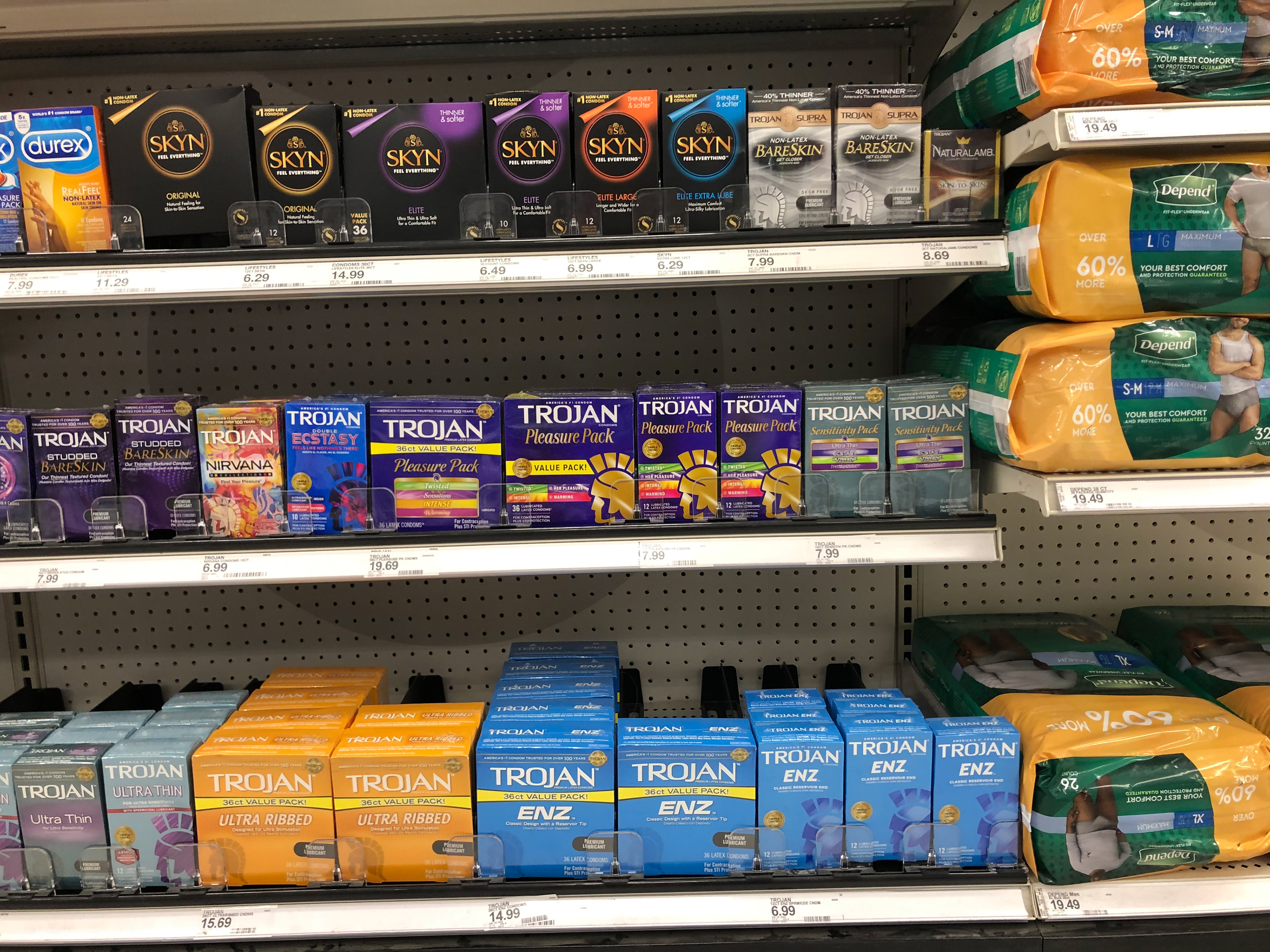
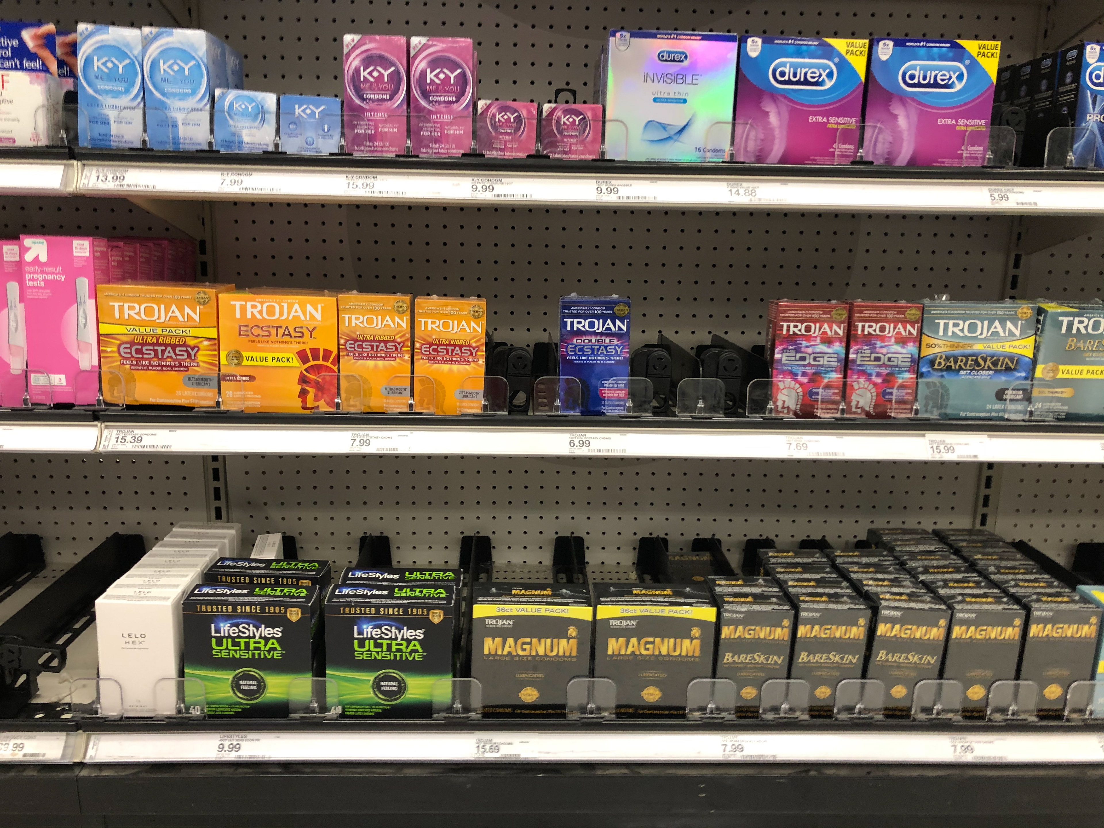
The other condom brands, like Skyn and Durex, are slightly more modern than Trojan, but still look very dark and serious. I thought immediately that something playful would stand out on shelves. Trojan’s colors seem sterile, like latex gloves or adult diapers (which were displayed next to them at the Target store I visited).
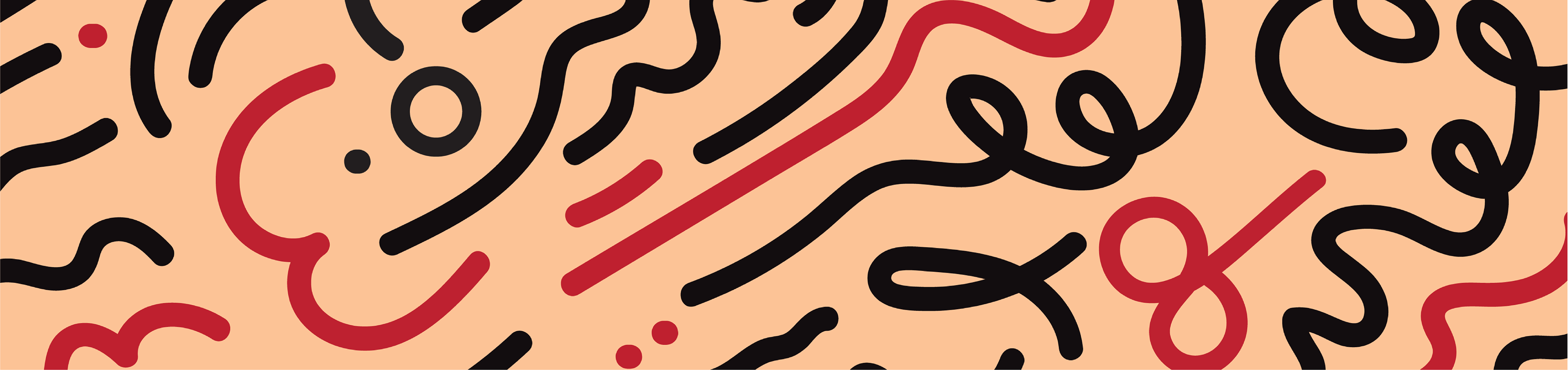
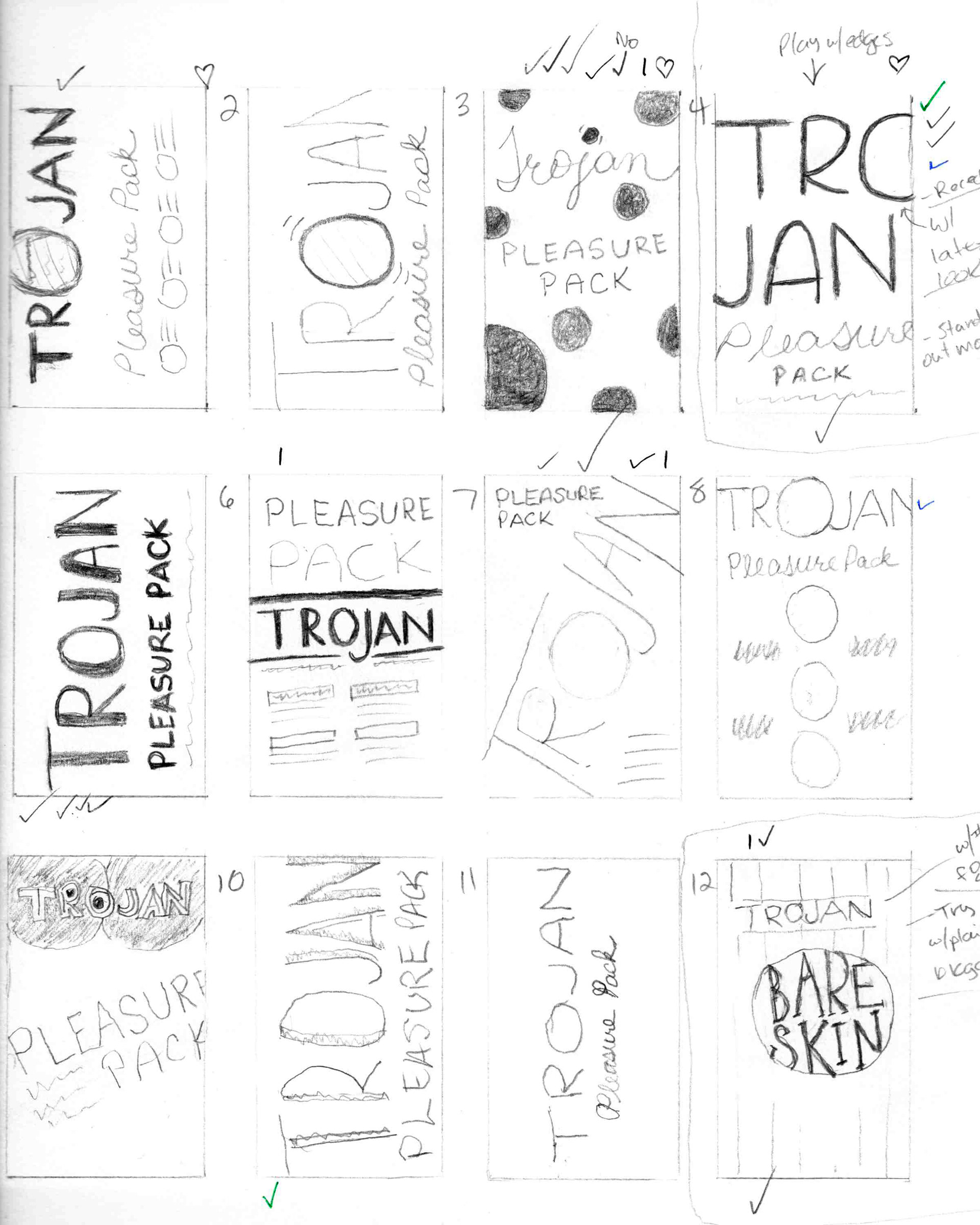
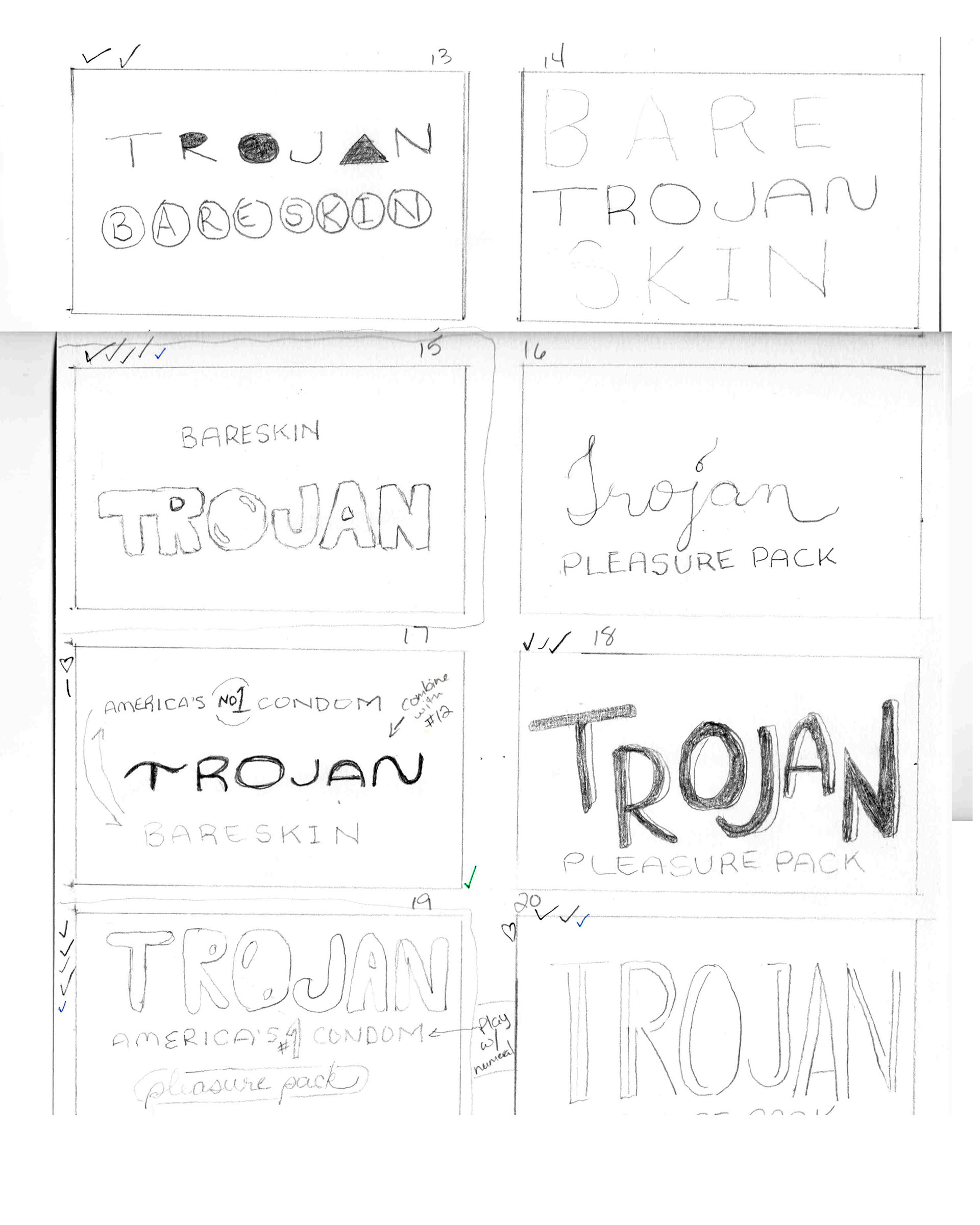
Sketches
I played with the idea of the “O” in Trojan being a window into the box displaying a condom. I also tried giving the “O” some shine as if it were actual latex in some sketches. Ultimately, using the name of the line of condoms in a suggestive, organic type treatment felt like the best fit.
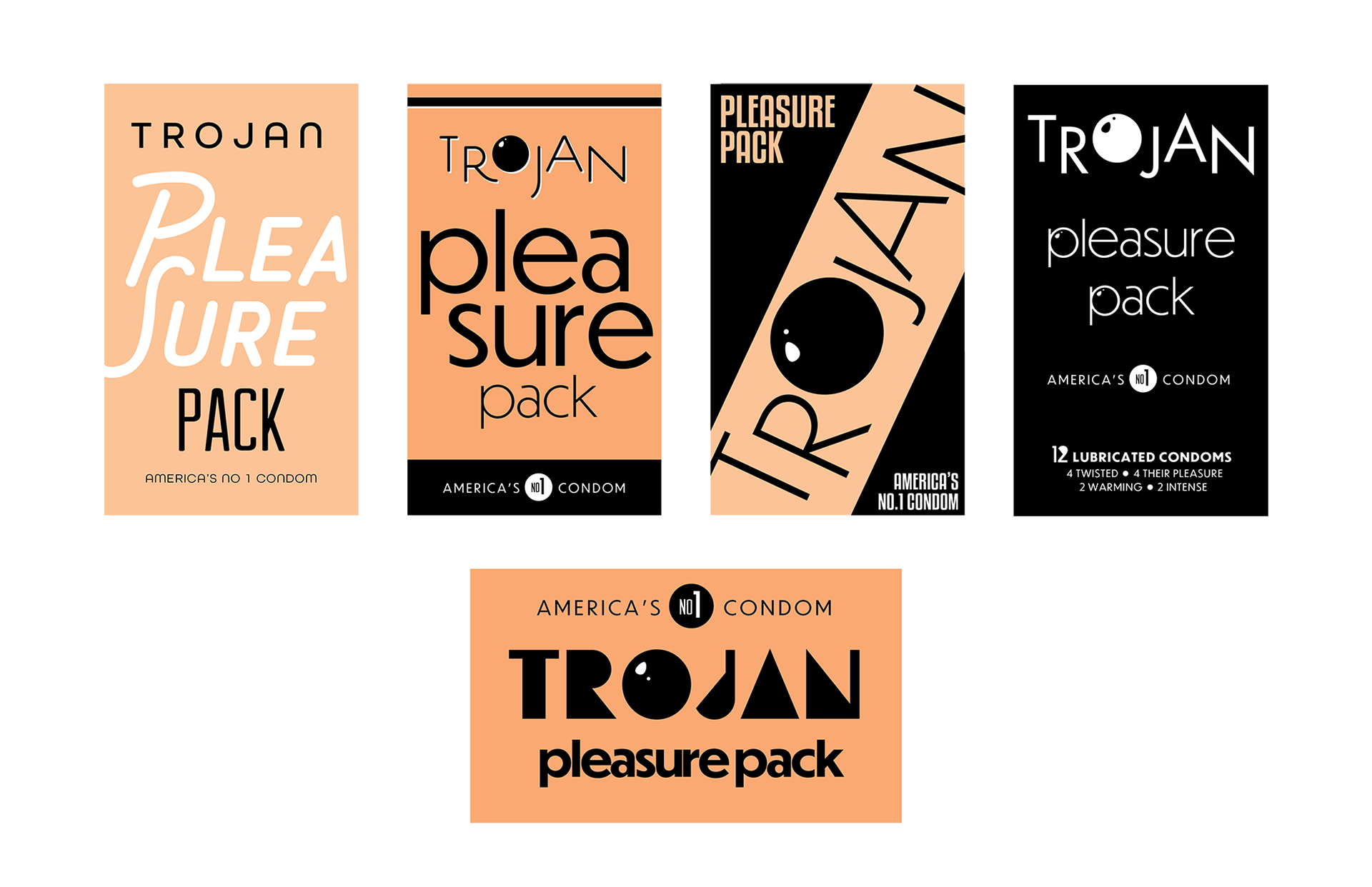
Digital drafts
I started out using skintone-like colors with black, plus a playful shininess to the “O” shapes to mimic latex. I realized this wasn’t translating well, and also wasn’t representative of all skintones. So I decided more warm and saturated colors were needed instead.
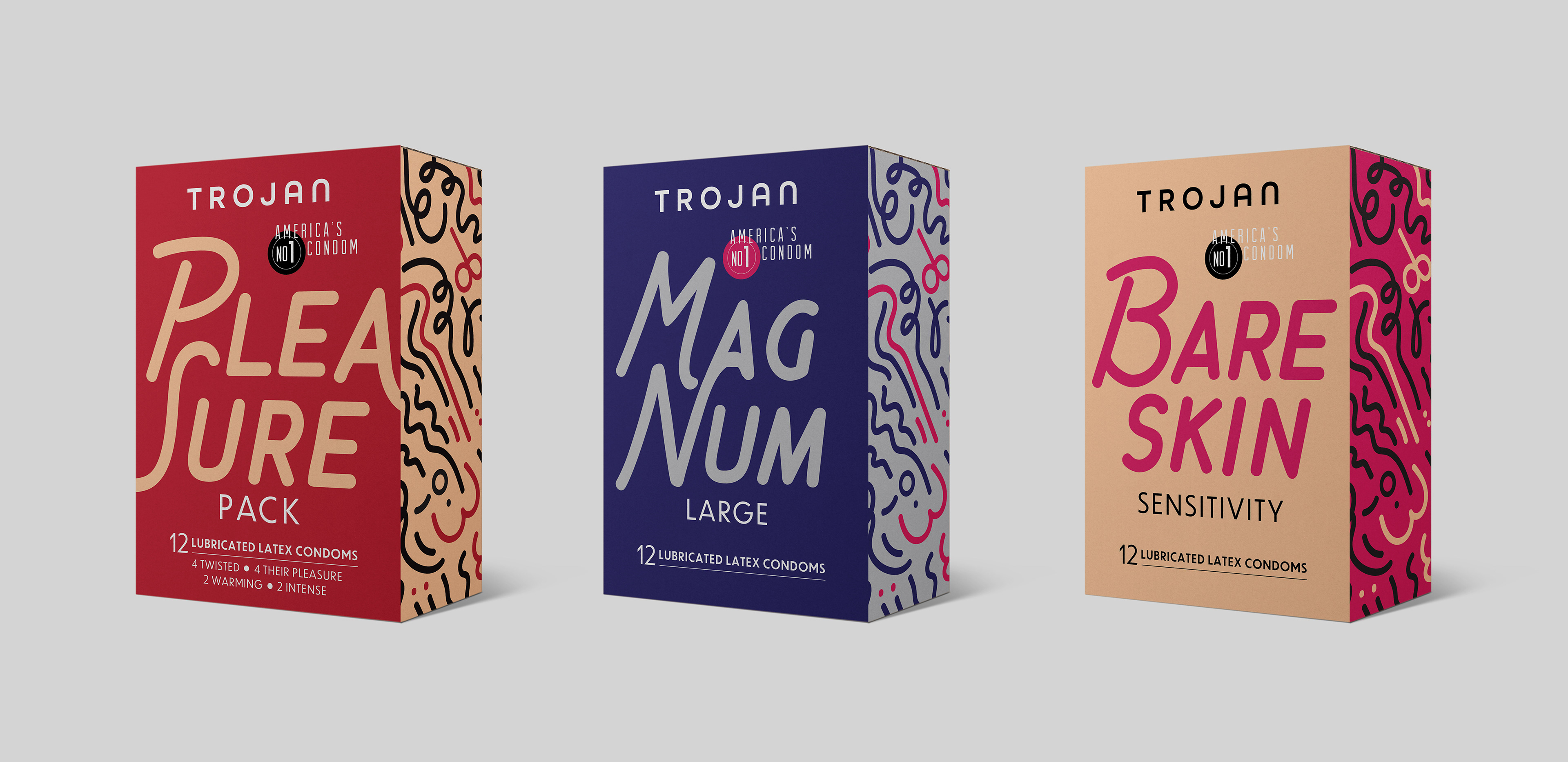
Final solution
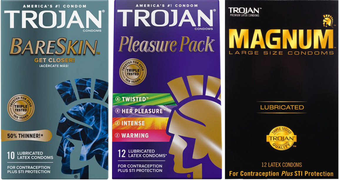
I chose three popular Trojan products to redesign: Pleasure Pack, Magnum, and Bareskin condoms. The playful, somewhat suggestive font Chippewa Falls is both strong and organic, and the colors convey passion. I felt the Magnum packaging needed to be closer to the original, all-black box, but softened the dark look with a rich blue and steel gray instead. The typography inspired the whimsical side pattern with a hint of innuendo.
Reflection
As a woman who buys condoms, I knew I would be happier putting these packages in my cart. I also asked a 41-year-old single man what he thought, and he enthusiastically endorsed my redesigned Pleasure Pack box. These boxes could even be displayed instead of hidden away. I think a rebrand is something Trojan should consider in any case.