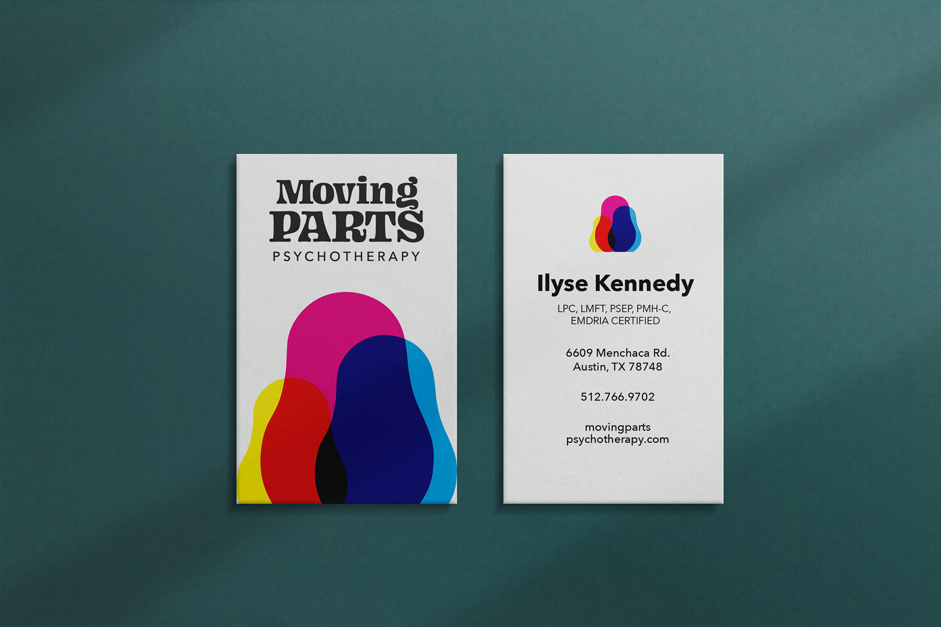

Moving Parts Psychotherapy Logo
A local therapist needed a logo and sign for her new practice. Her therapy includes Internal Family Systems, which addresses sub-personalities (or parts) within people, such as our internal wounded child. She also uses nesting dolls as part of her therapy, and wanted to include them in her logo.
Process
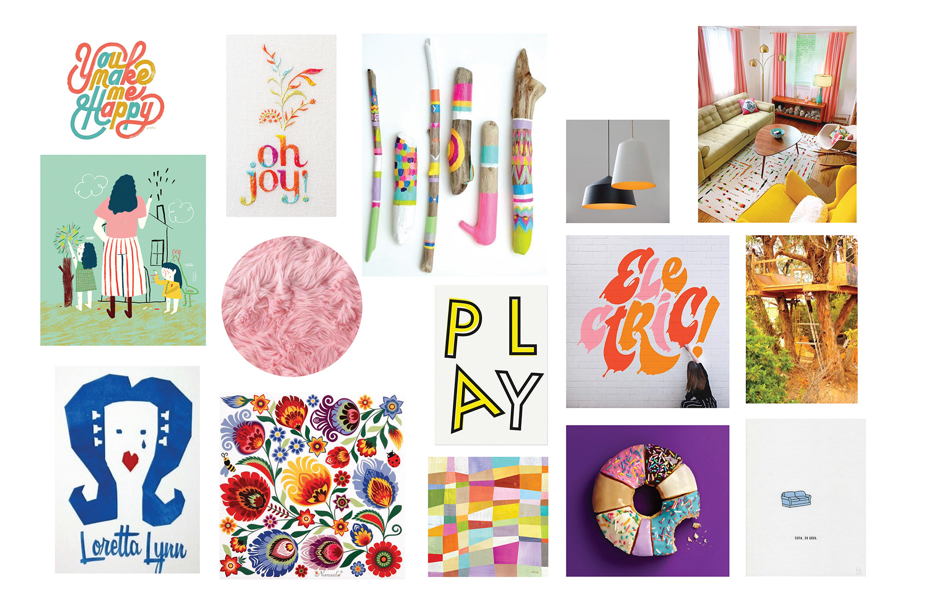
I interviewed the client, then wrote a creative brief and made a moodboard to guide both of us through the process. The standout adjectives she used to describe her business were “creative,” “comforting,” and “unpretentious,” as well as having a mostly female clientele. I also researched IFS trauma therapy to better understand her practice. The images I chose were whimsical, warm, and stylish.
Digital drafts
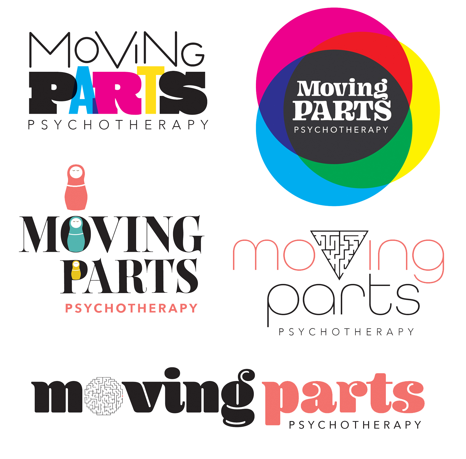
Since the client’s target audience is young, creative, diverse, and mostly female, I worked with bright colors and playful typography. I also wanted to show representations of the brain as a maze, and show the paths we take to work on our mental health. It is also a nod to some of her therapy through games and play.
Final logo
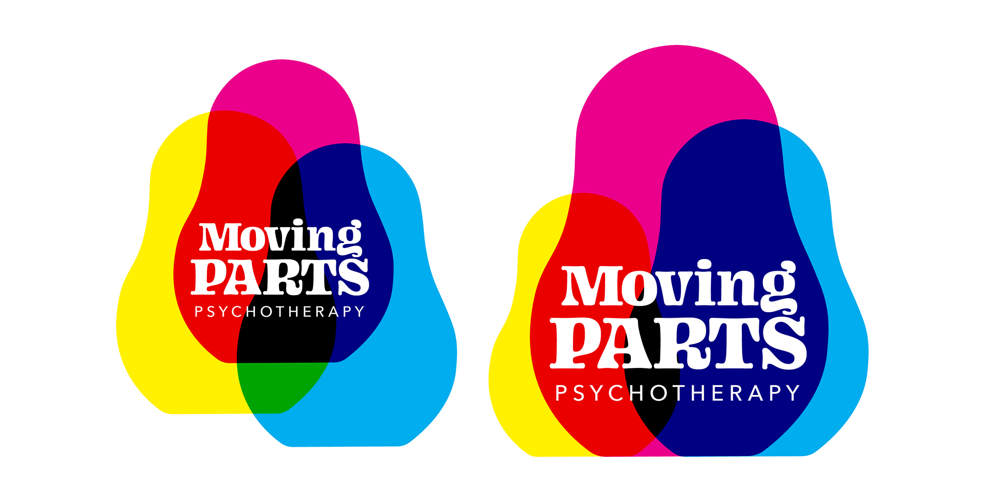
The client was drawn to the logo with bright, interlocking circles, but was still missing the nesting dolls concept. I simplified the doll shape to replace the circles, and found the effect to fit well with the client’s love of the groovy ‘70s style.
Reflection
This was one of the earliest logo projects I worked on, and I'm still proud of how it turned out. I worked closely with the client, who was very happy with the final design. Through this project I learned how to interview a client and write a creative brief, how to utilize that information and set a style, and how to communicate throughout the process. It was a wonderful introduction to logo design.