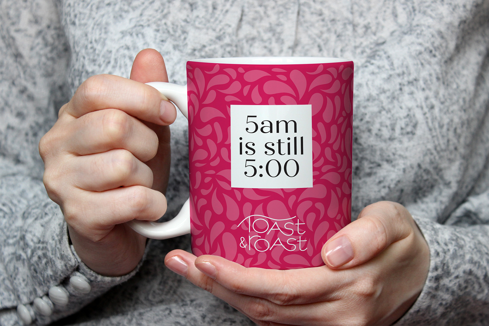
Toast & Roast Spiked Coffee
Your favorite thing about morning meets your favorite thing about evening. These convenient adult coffee mixed drinks are the perfect way to enjoy your precious days off without the brunch crowd. A delicious blend of roasted coffee with rich liquor, Toast & Roast can be enjoyed straight from the can, or heated up in a mug for cold weather imbibing.
The Challenge
I was tasked with creating a new beverage, including naming, logo, and packaging design. I landed on a product I hadn’t seen much of, a spiked coffee you could drink at home or take to the pool. I wanted to design a stylish can that is recognizable as a coffee mixed drink, but doesn’t rely on the name of a beer or liqueur company (like Pabst Blue Ribbon’s Hard Coffee or Kahlua). It should stand out as more special than a national brand, and convey the feeling of the drink itself.
Target Audience
Fun-loving adults who don’t want to waste time standing in line for mimosas and an overpriced omlette. They want to kick back and relax on the weekend, and this brings part of the brunch experience to their kitchen tables.
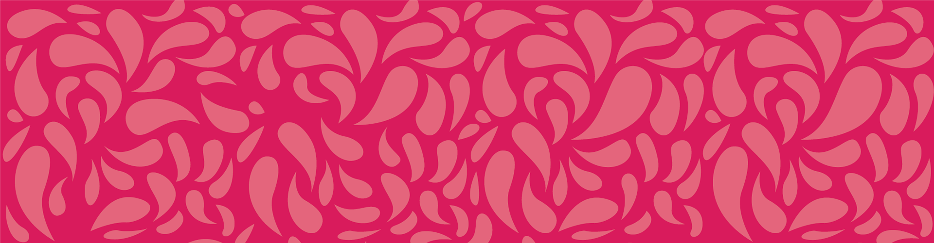
Moodboard
I looked for patterns and colors that were evocative of the morning coffee experience. Bringing the look of the beverage to the outside packaging inspired me, as well as playful, original lettering.
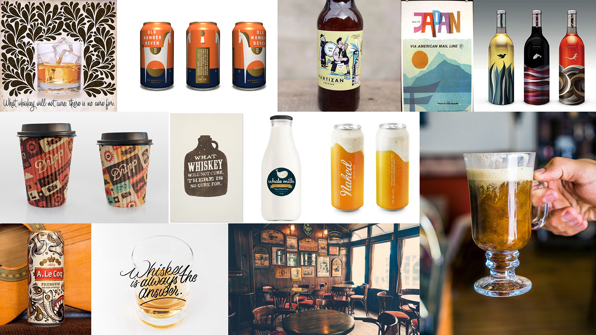
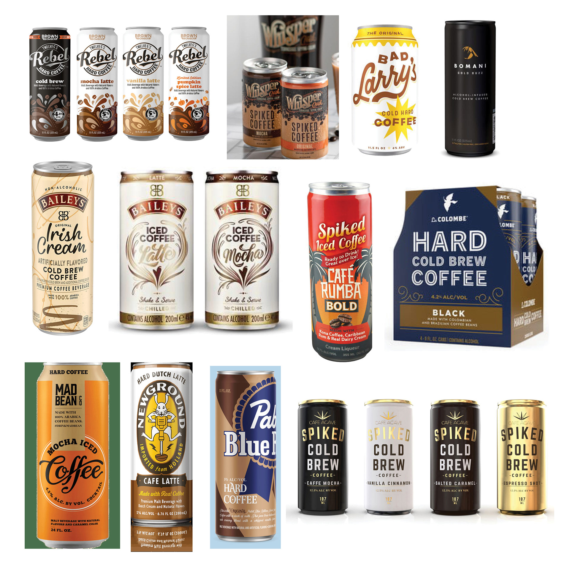
Competitive analysis
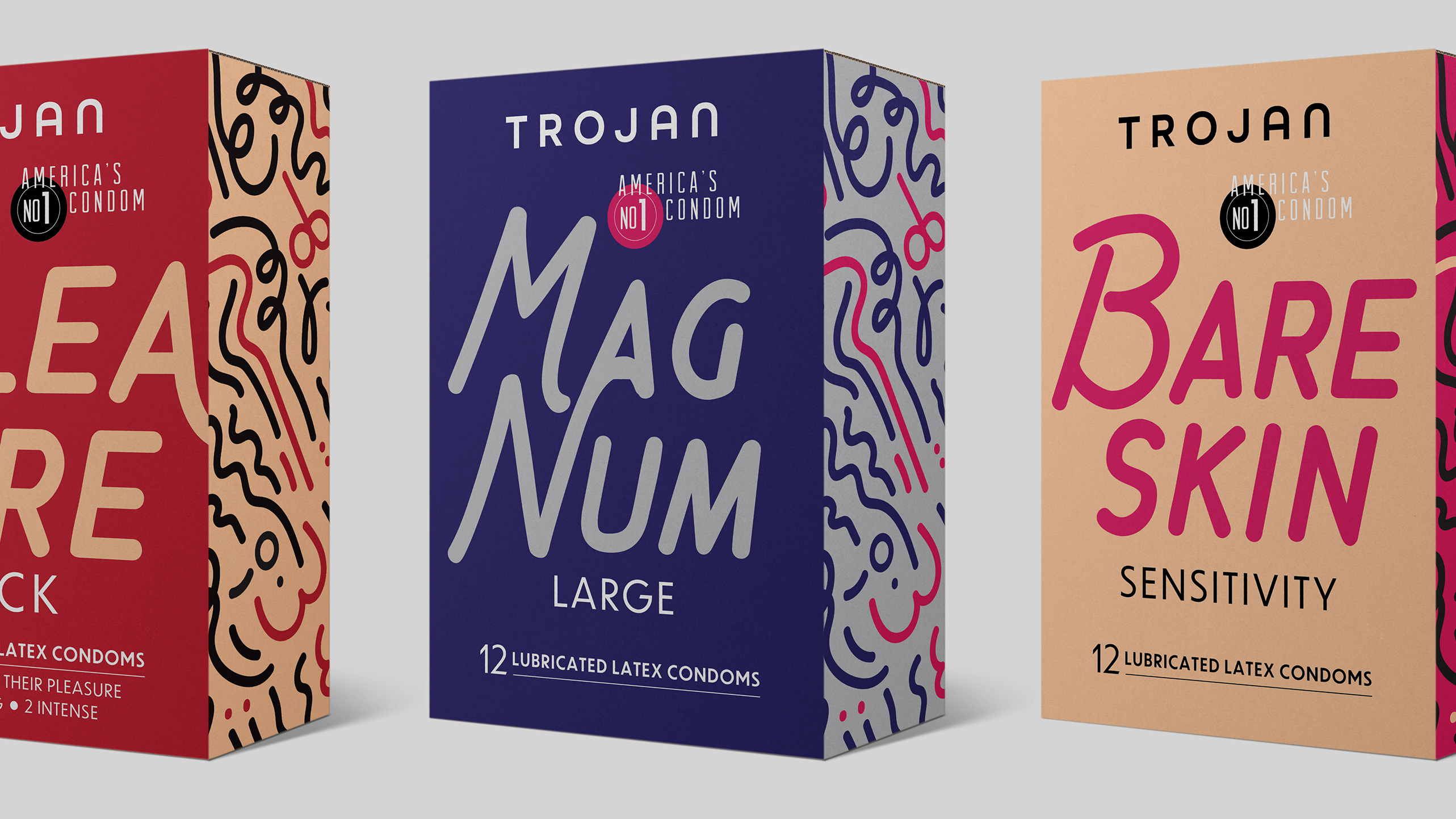
There aren’t a ton of these types of drinks, but the ones you might find at the grocery store rely on a well-known alcohol brand. This could be a benefit or a difficulty for a small company.
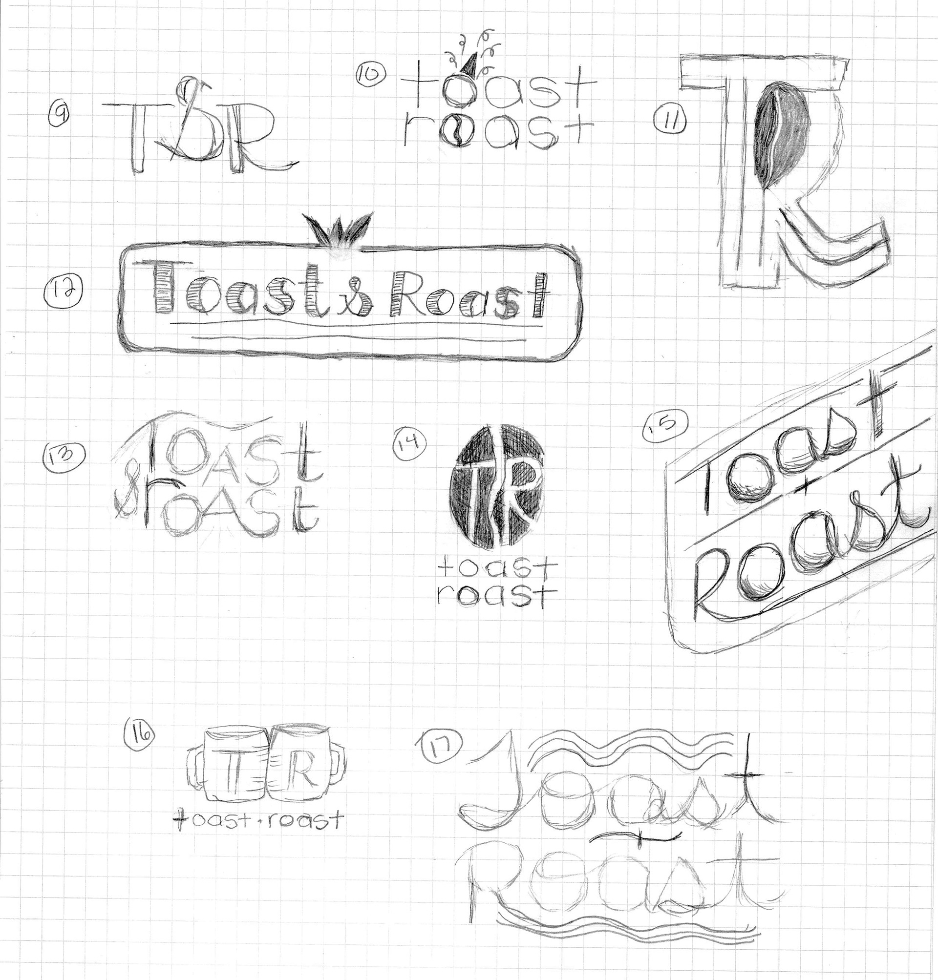
Sketches
I tried to convey the idea of warmth, as well as representations of both celebration and coffee.

Digital drafts
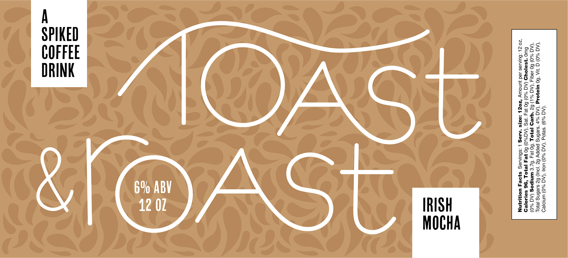
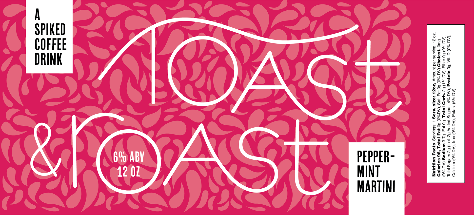
I went to the computer with the whimsical, hand-lettered logo, as well as one that is reminiscent of a diner, and another that simplifies the name down to just two letters. Ultimately, I decided the best logo was the most hand-lettered, giving it a feeling of craft and uniqueness.

label design round 1
I added a swirly pattern that evokes the look of cream in a White Russian or Irish Coffee, while adding playfulness to the label and matching the logo’s hand-drawn charm. In the first iteration of the label design, the pattern floats around the logo, and the identifier of the type of beverage is in a small ring around the top of the can. I wanted to make the logo, as well as the label "Spiked Coffee Drink" more prominent and dynamic.
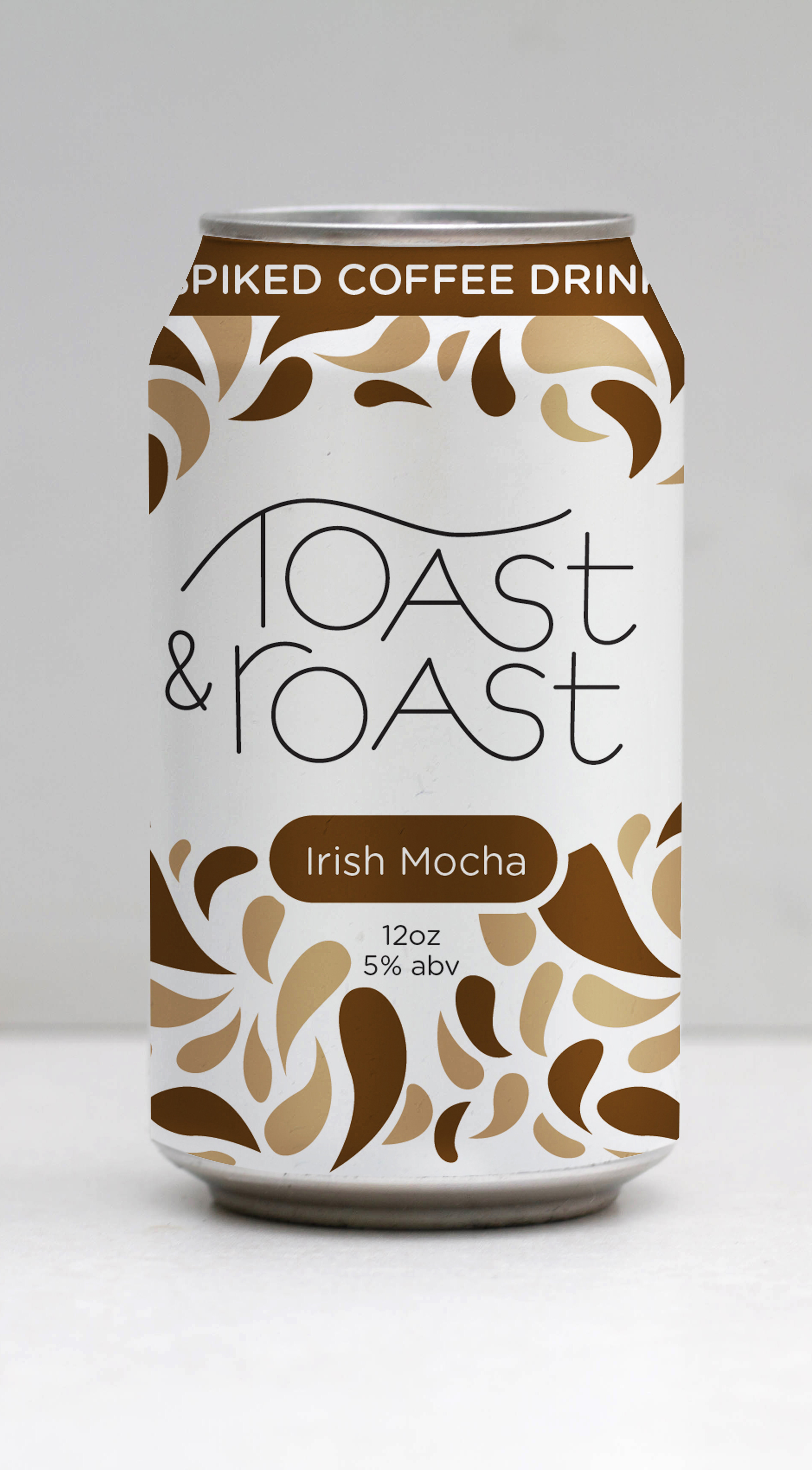
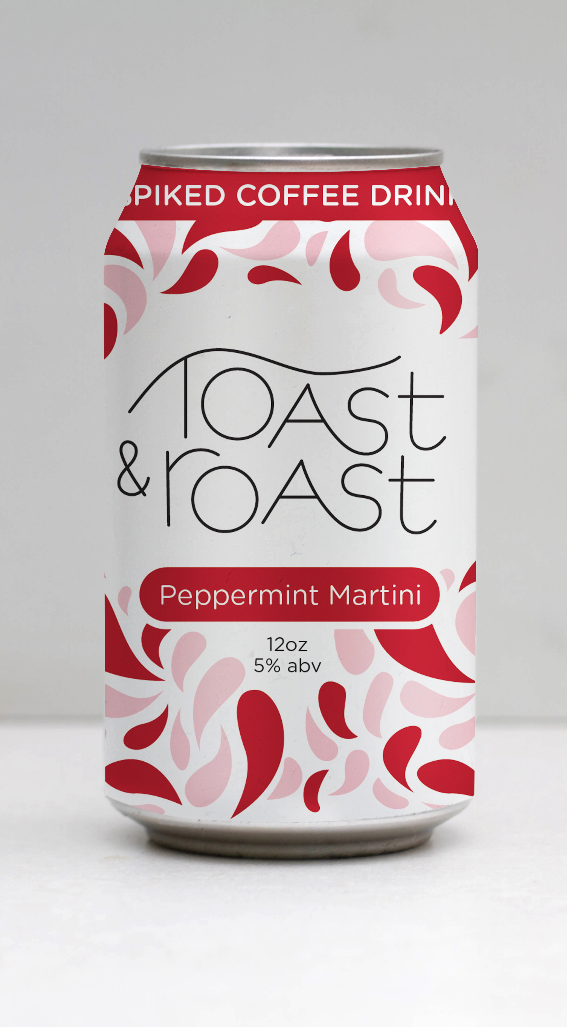
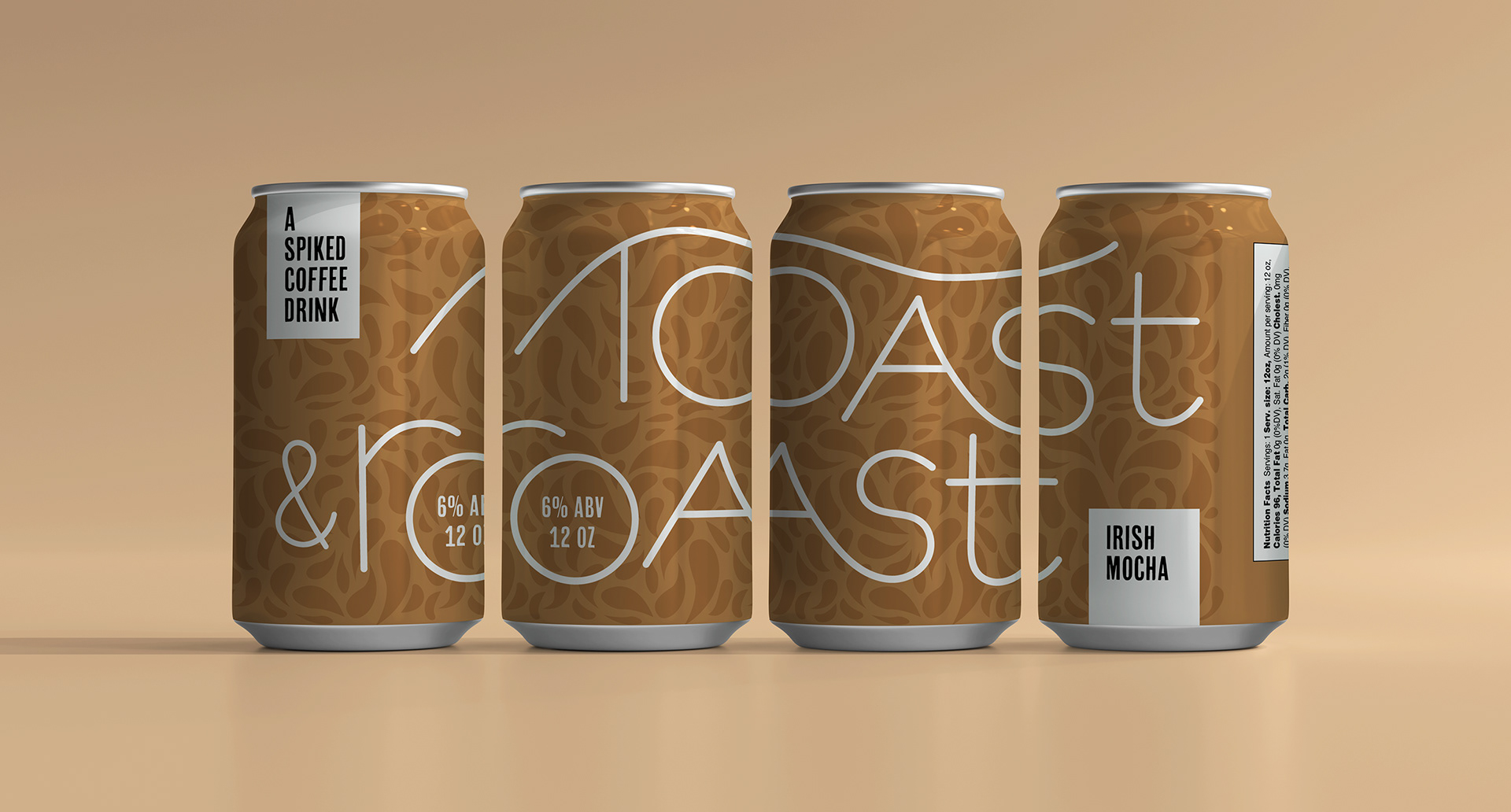
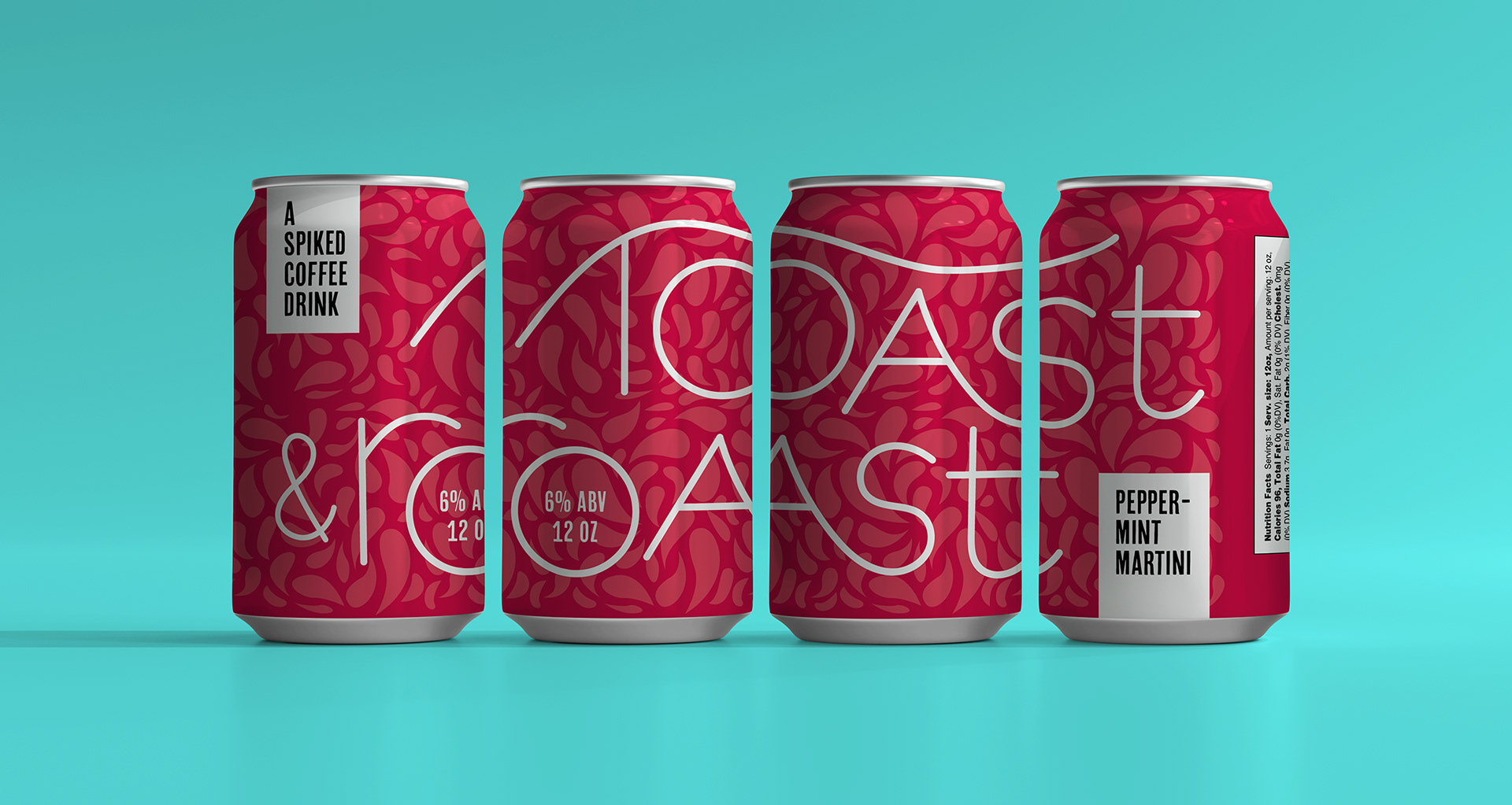
final solution
To show the logo in full effect, I made it large enough that you'd have to turn the can to see the whole thing. This provides an experience for the customer by giving a hint of the design, then getting them to interact with the product. The can design both stands out and fits in with other alcoholic beverages, and I would be drawn to it as a consumer who enjoys these kinds of drinks.
reflection
I would be intrigued by this product if I saw it in a store, it's a new take on an old idea: Breakfast drinks. I was also excited to make a hand-drawn logo and blow it up to be the star of the packaging. I got lots of great feedback that made it shine, and I appreciate the opportunity to create such a unique and likable concept.