
The Testaments Book Redesign
The Testaments is the long-awaited sequel to The Handmaid’s Tale, by Margaret Atwood. It addresses many modern issues, including the subjugation of women, moral panic, authoritarianism, environmental disaster, and family separation.
The Challenge
To design a compelling cover that complements the original novel's cover, keeping the illustration style and color palette in the same family.
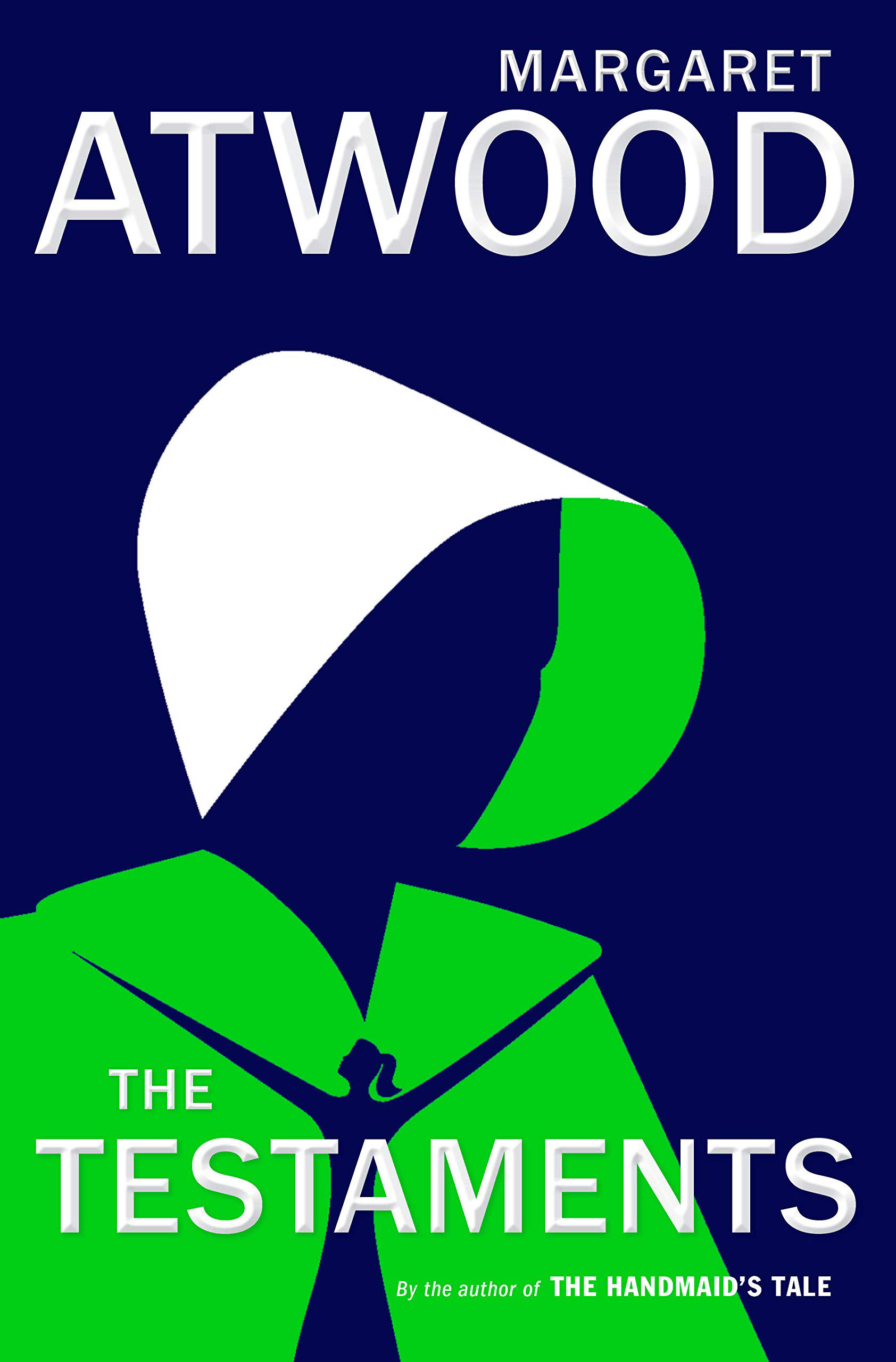
The current cover for The Testaments is overly simple, and is reminiscent of many YA book covers, therefore doesn’t stand out on shelves. It's also unclear why the handmaid is wearing green, as that is the color that Marthas wear, yet the character is wearing a handmaid’s bonnet. The title's typography also strays from the style of the first book cover.
Target Audience
Most of the audience has awareness of the original book, either through reading The Handmaid’s Tale or watching the award-winning series on Hulu. It skews heavily toward women and fans of dystopian fiction, which is now a huge part of the Young Adult readership. It would likely be displayed on bookshelves near series like The Hunger Games and Divergent.
Discovery
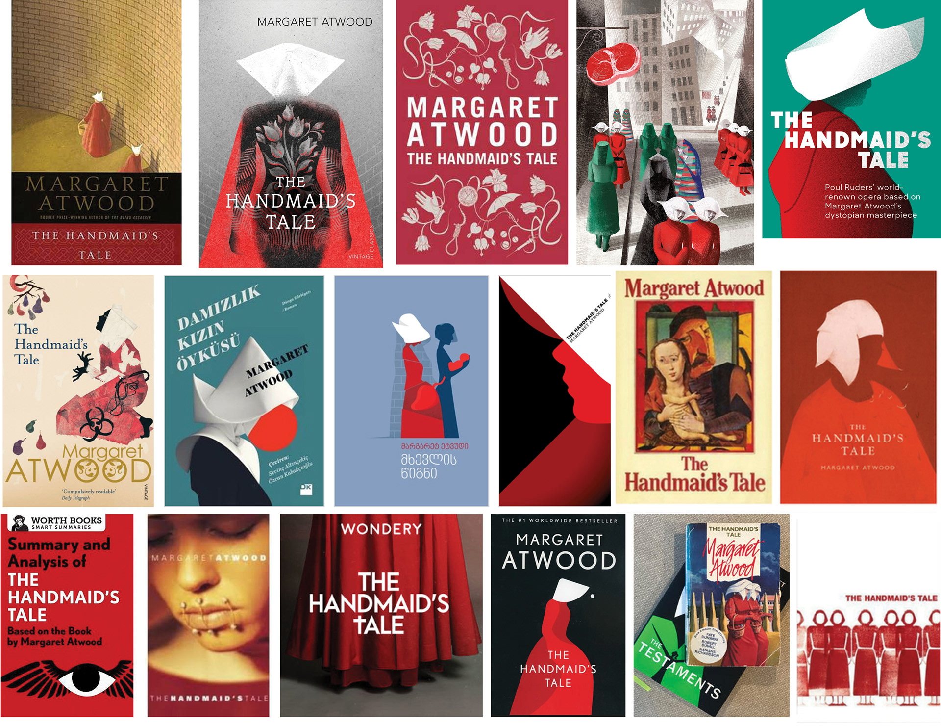
I researched existing book covers, art and media featuring The Handmaid’s Tale to better understand which themes had the most impact. I noticed that the bonnet was used often, some of which brought to mind the comedy show The Flying Nun. I gravitated to the edition showing handmaids walking near The Wall, a constant, intimidating presence as both a place of punishment by hanging, as well as the walls of a prison.
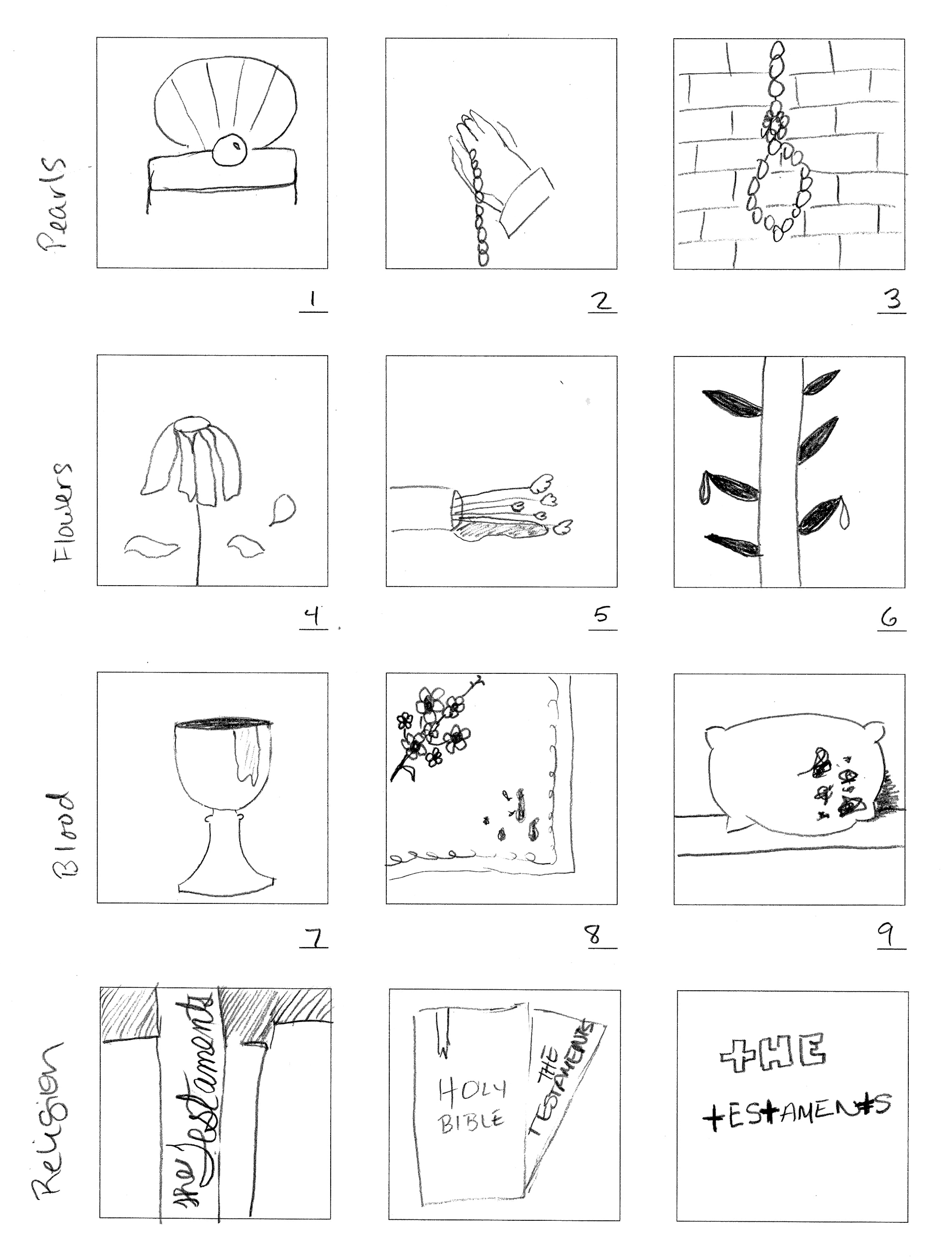
Sketches
I focused on four main themes throughout the book.
PEARLS: Representing pureness, virginity, and perfection. Fake pearl necklaces are worn by the “missionaries” called Pearl Girls, who convince women abroad to travel back to Gilead for enslavement.
FLOWERS: Representing fragility, beauty, death. Women in Gilead make embroidery featuring flowers, a hobby they do because they are not allowed to read or write.
BLOOD: Represents violence, oppression, death. The threat of being hung on The Wall is meant to keep citizens of Gilead in line.
RELIGION: Used as a cudgel to subjugate women and keep power in the hands of the oppressors. “Blessed are the fruit” is one of many refrains that allude to the Christian bible.
drafts
I designed a pearl noose in front of the wall, embroidery with spots of blood, and a simple type treatment that shows the letter “T”s as crosses. I decided to move forward with the noose because it had the most immediate impact and was more closely tied to the whole story.
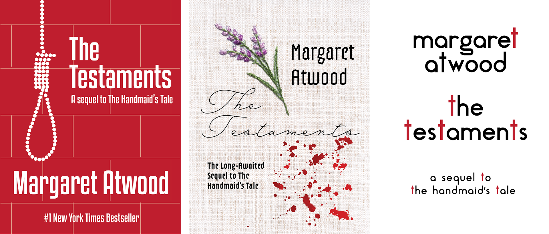
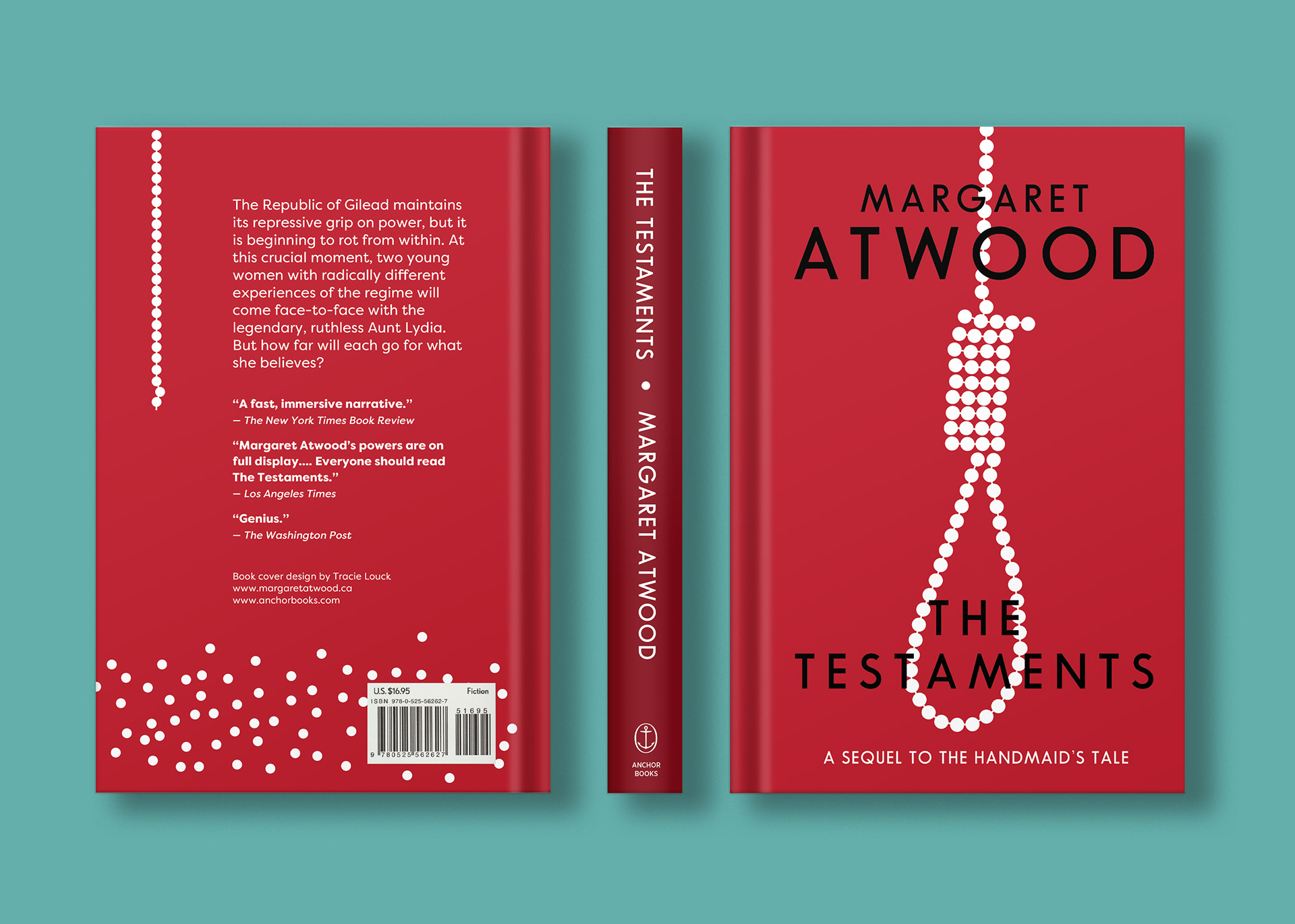
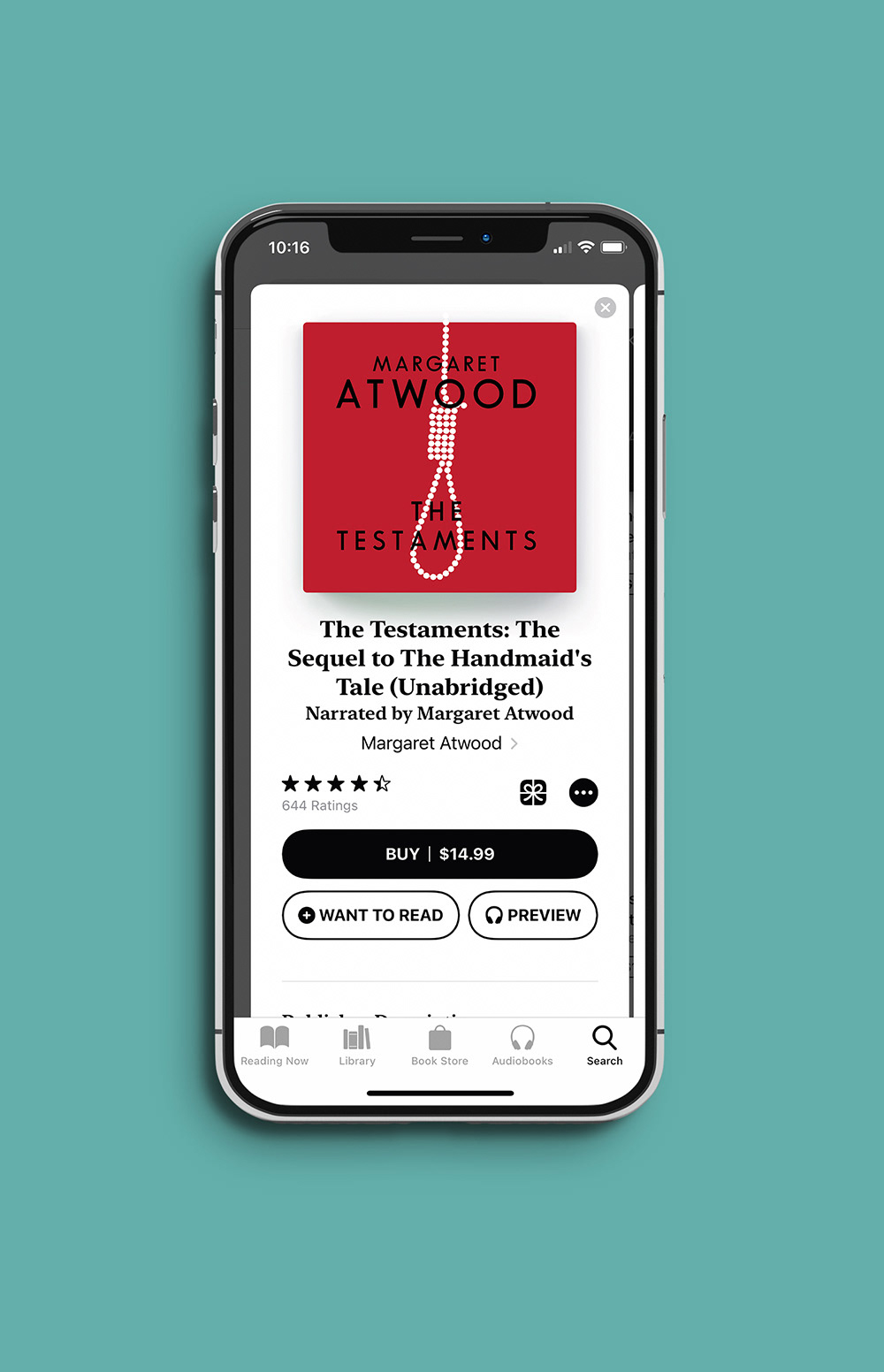
Final Design
I took out the brick wall background and let the pearl noose stand alone as a stark enticement. I also referred back to the original Handmaid’s Tale book cover and designed the typography to work within the series.
Reflection
I was excited to read The Testaments and pay close attention to the themes throughout, which I used to sketch several concepts. The pearl rope forming a noose would intrigue just about anyone, and the front-to-back storytelling with the falling pearls shows progression and intrigue. I think my redesign was successful, it gives the reader a hint of the new Pearl Girls aspect without giving it away.