Dwell Lounge and Shop
Dwell is an eclectic bar with mid-century vibes that looks and feels like a home. Complete with couches, rooms to wander in and out of, well-designed interior decor that is available for purchase, and a cozy backyard, Dwell feels less like a typical bar, and more like a friend threw a great house party.
The Challenge
Create a new business concept, including naming and branding. I combined my love for a great gathering place with my passion for vintage shopping. I’ve found that the bar scene is a bit unapproachable as a single, or an introvert, or a person beyond their 20s. We all want a chill place to socialize and get out of our house, and Dwell provides that along with a fun retail experience.
Target Audience
Adults who don’t like loud, intimidating, cavernous bars and clubs, but still want to go out. This is a place where you can read a book in a comfy chair by yourself, or gather with your friends and have a good conversation you can actually hear. Those who enjoy eclectic home decor will especially love the tie-in with local vintage stores and their merchandise.
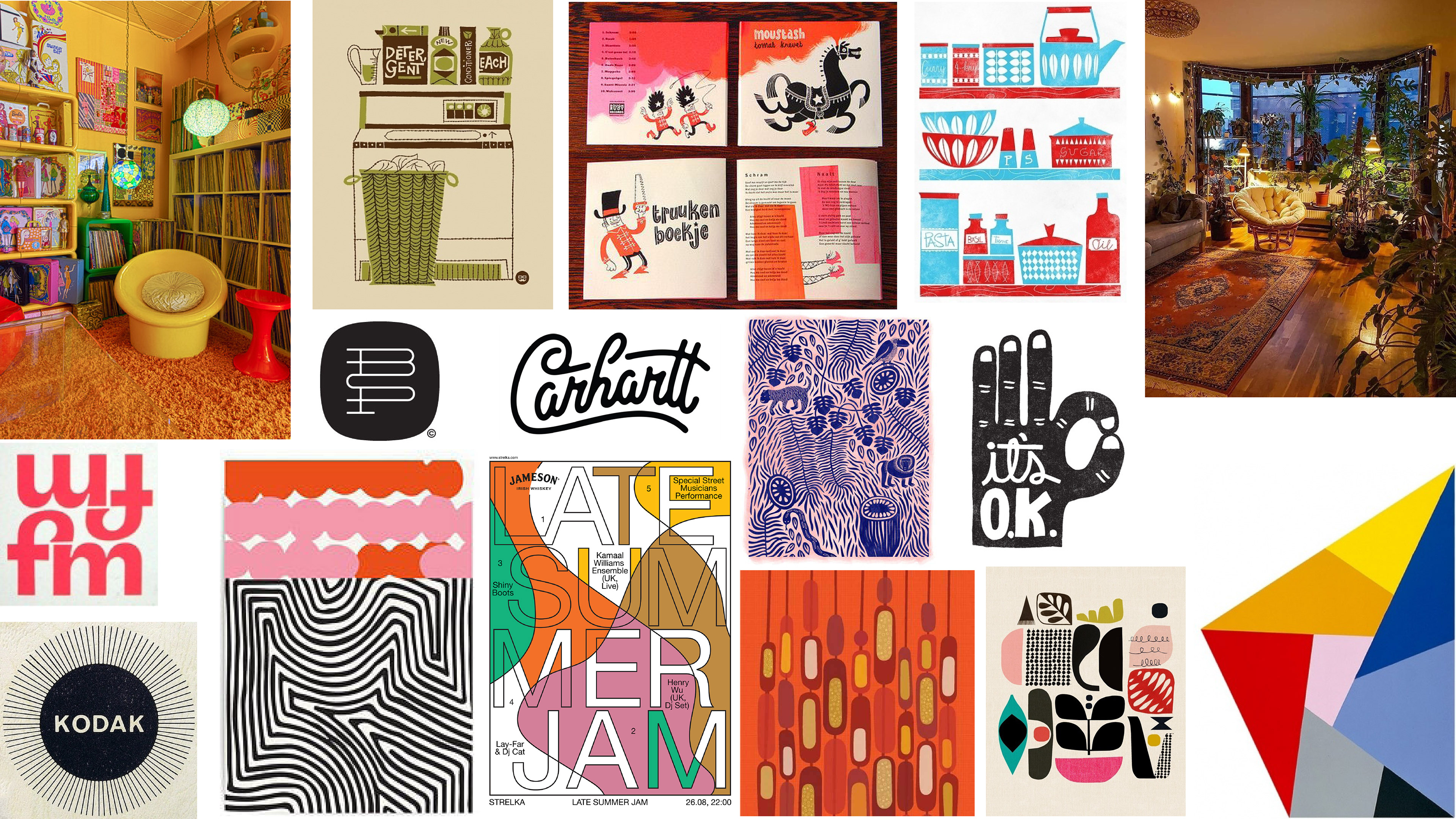
Moodboard
I was inspired by mid-century interior design, graphic design, and playful/retro color palettes and typography.
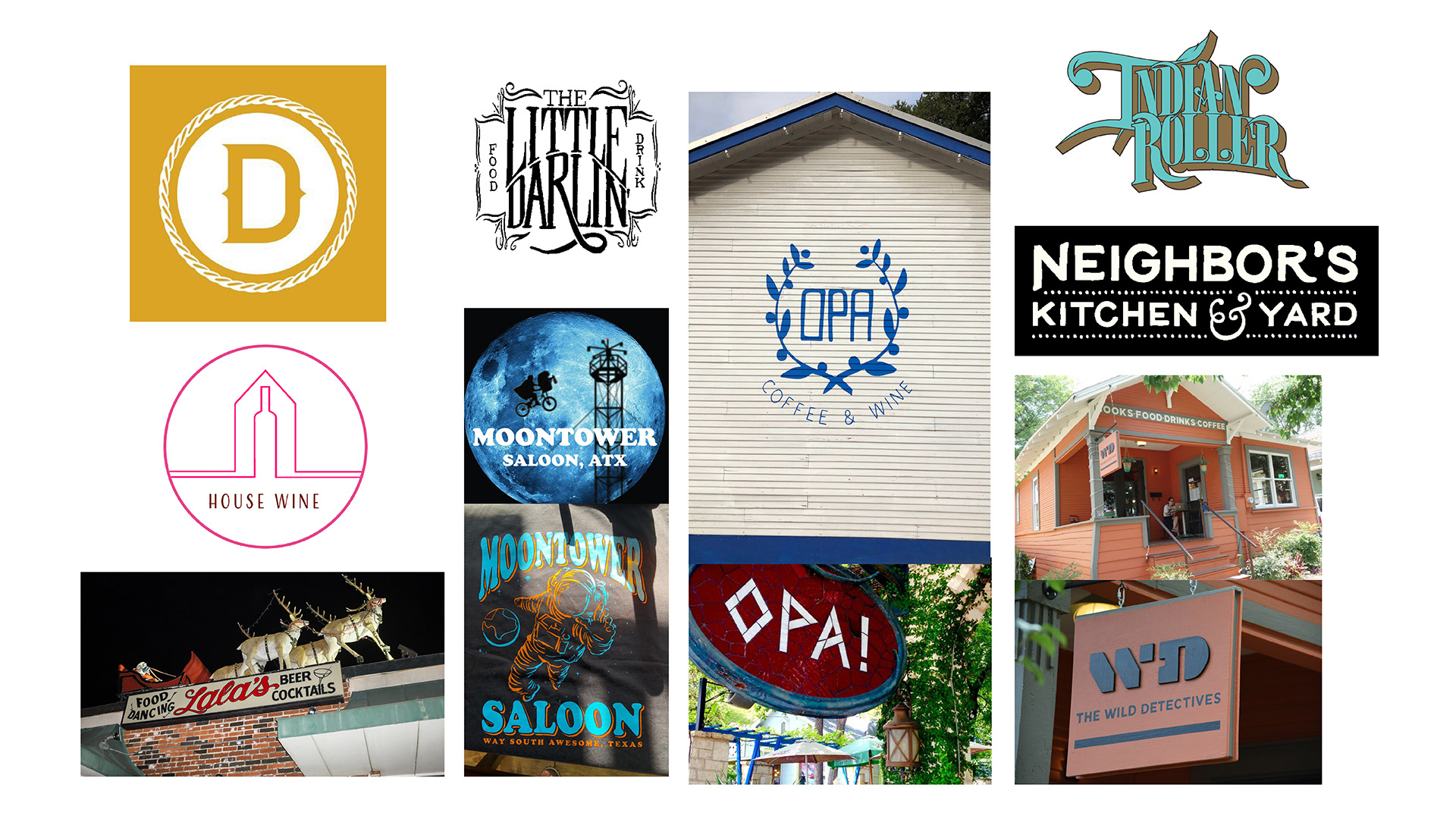
Competitive analysis
Places like Opa and House Wine have both indoor and outdoor spaces that feel like a residential property. The furniture is eclectic and casual, the yard has old trees, and there is an air of relaxation and nonjudgment. I strive to make Dwell feel this way, but elevate the interior design by focusing on midcentury trends.
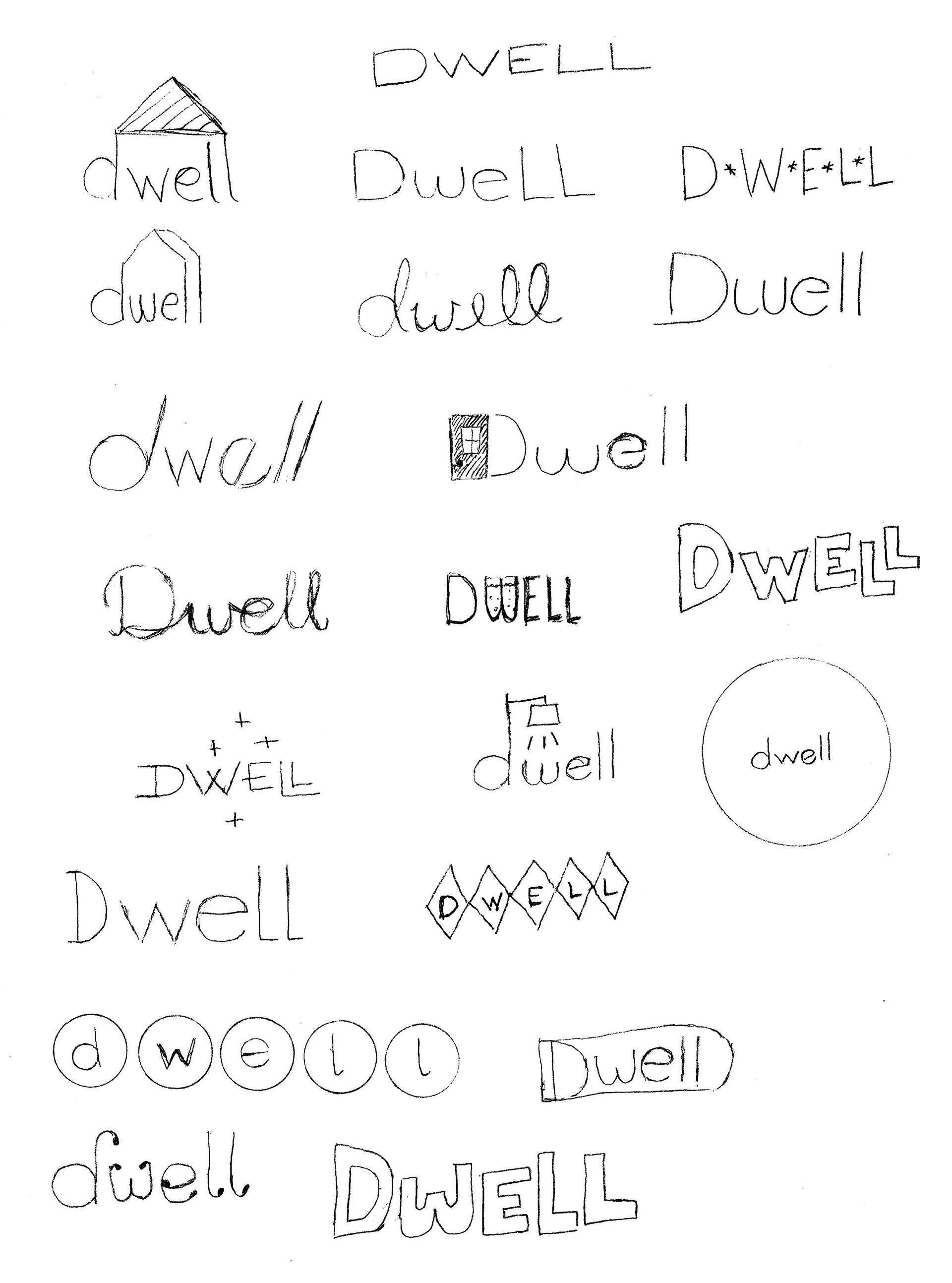
Sketches
My initial ideas leaned toward 1960s-style signage for the logo. I also explored the idea of a house (or dwelling) and the feeling of being at home somewhere more social.
Digital drafts
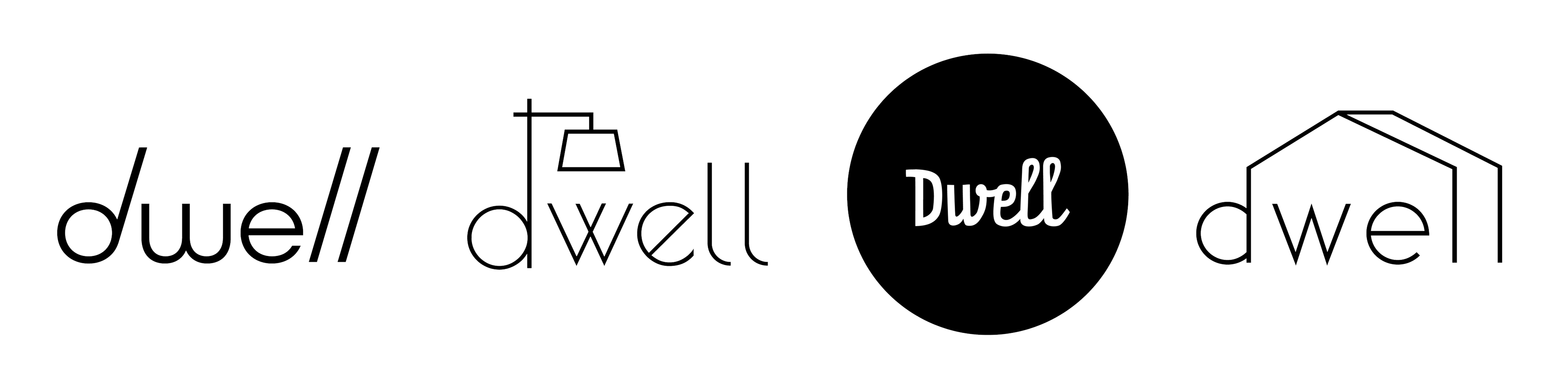
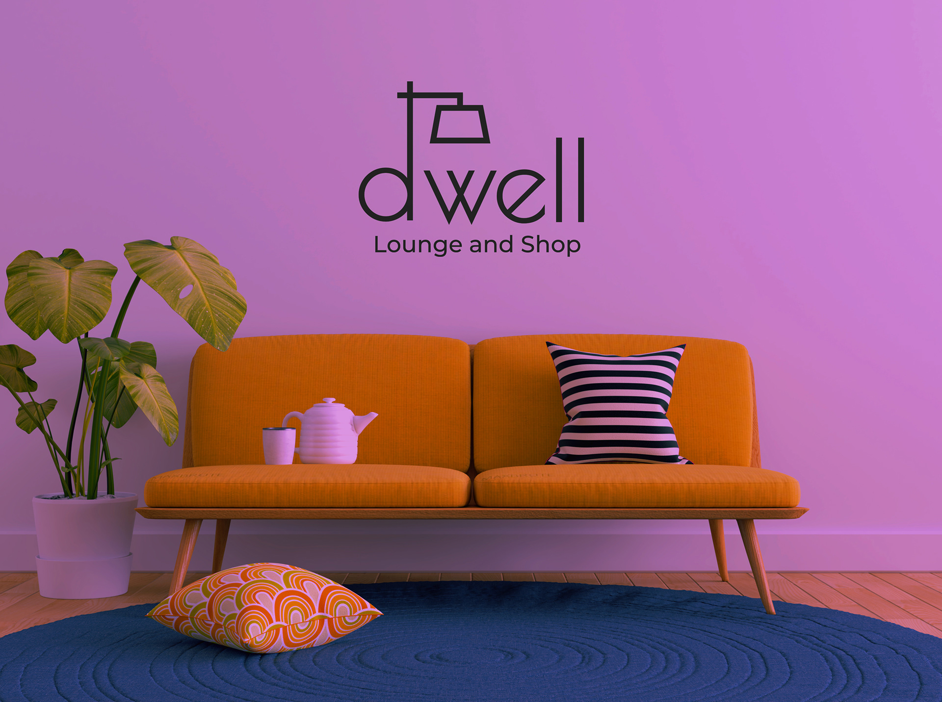
I chose four logos to take to digital. I liked the first one because it looks like the letters are kicked back in a chair, which fits the idea of a comfy place to hang out, as well as being a nod to 1960s modern typography. The second logo has a similar feel, but includes a midcentury-style floor lamp as the letter “d” to convey a stylish interior space. The last two logos were based on sketches I liked, but didn't combine the two ideas like the first two, so I left them behind.
initial design
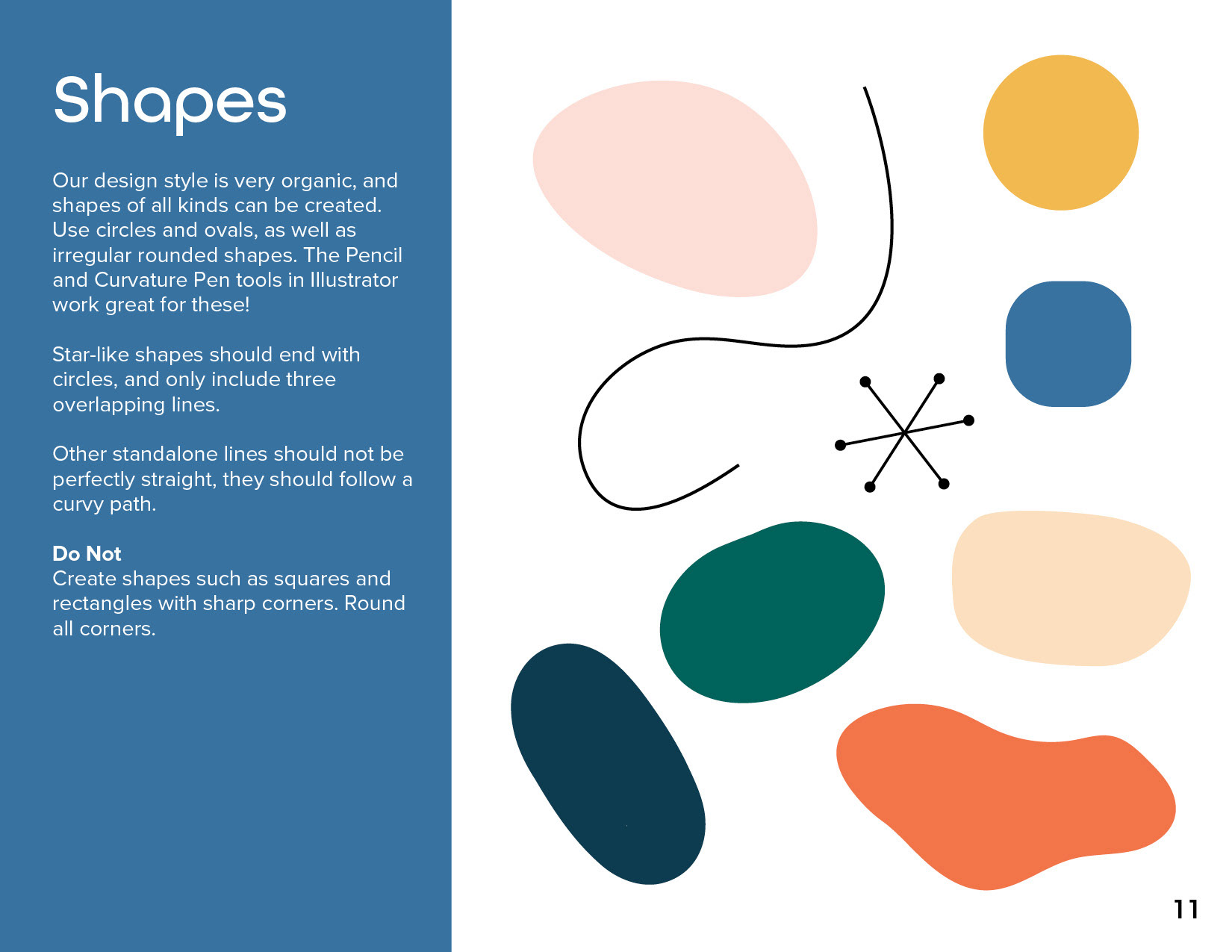
I chose the laid-back logo to go forward with, thinking its simplicity would work well alongside some organic shapes and earthy colors. But then I revisited this project a few months later and found myself less happy with it. It reminded me of too many designs I'd seen in social media and advertising, and I wanted a more unique brand and concept.
round two
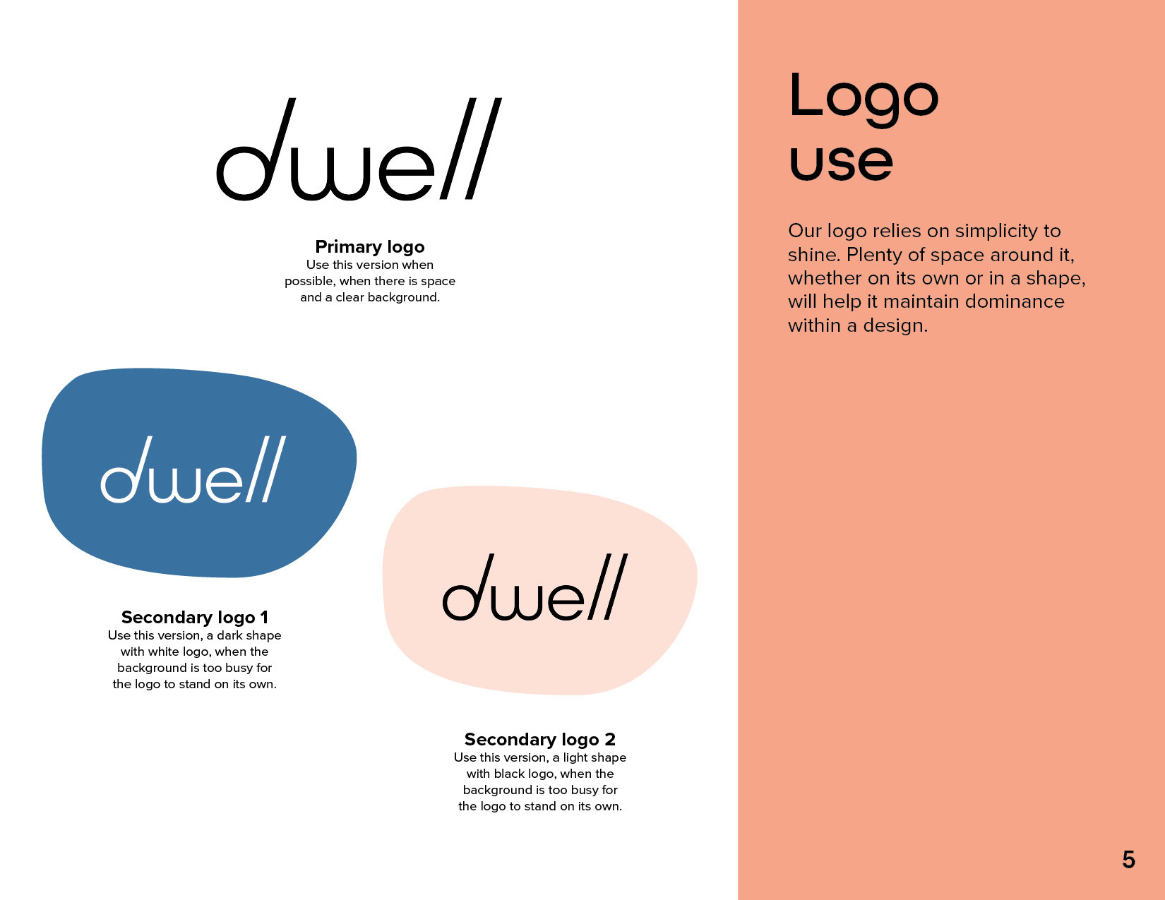
When I decided to make shopping part of the whole Dwell experience, I knew the lamp logo would be a better solution. I also moved away from the abstract blobs as design elements, since they're becoming ubiquitous in graphic design.
final solution
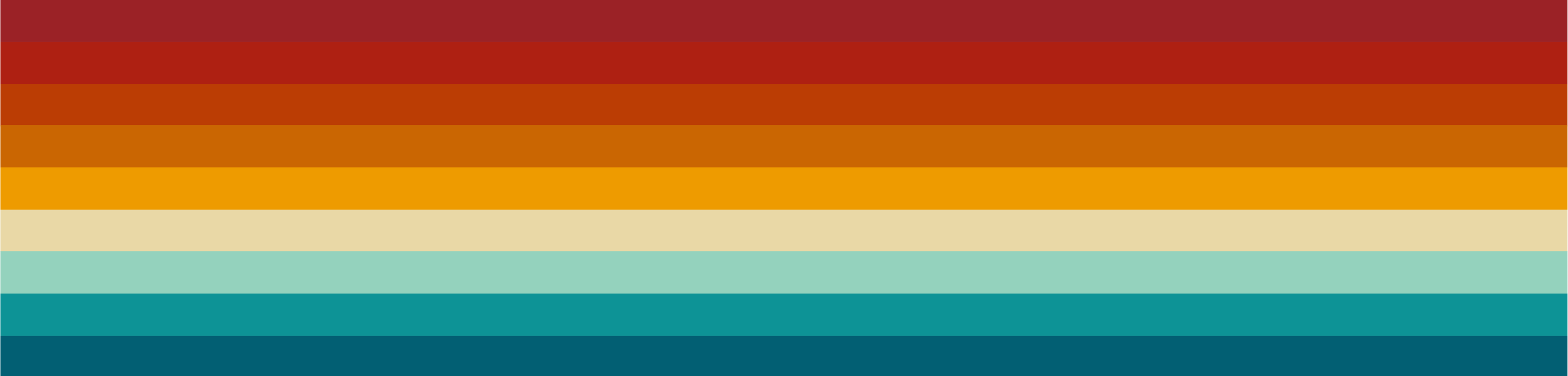
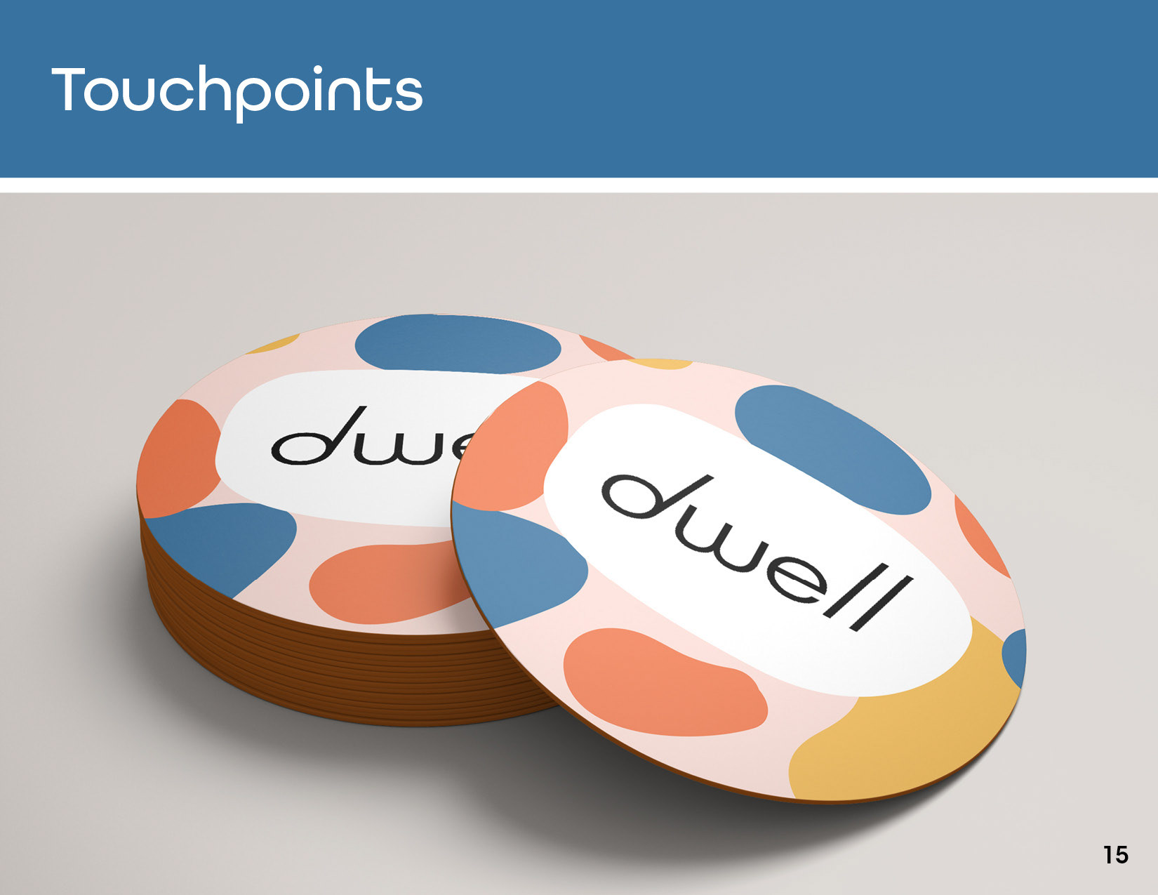
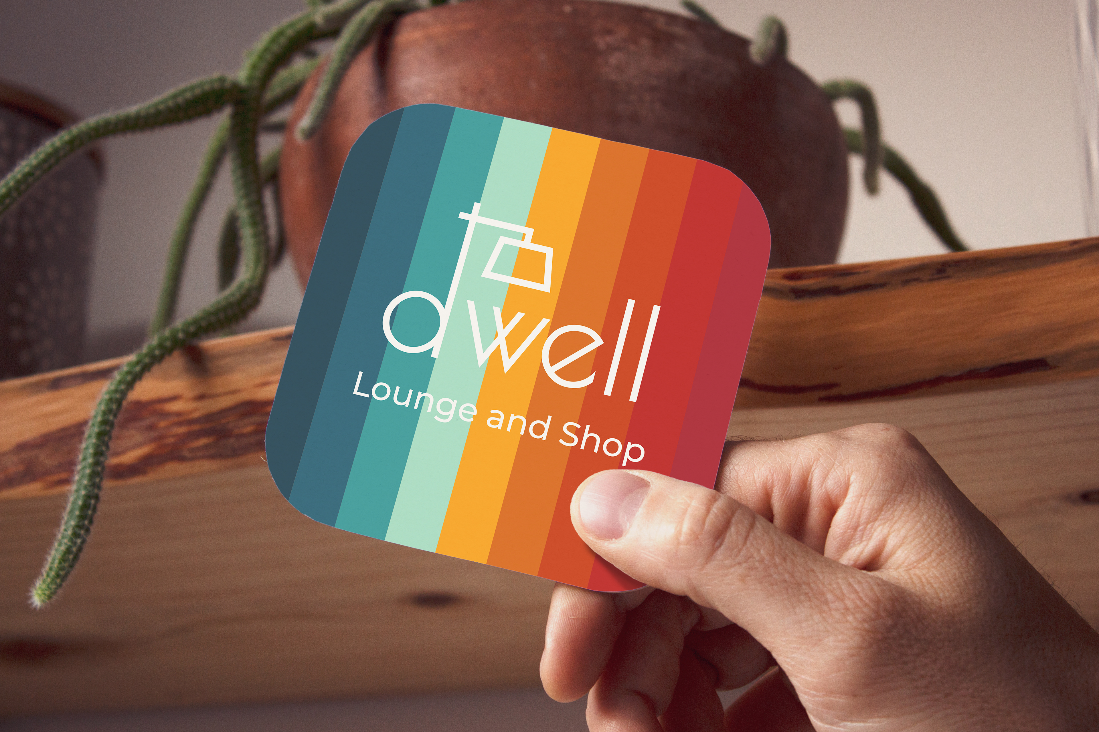
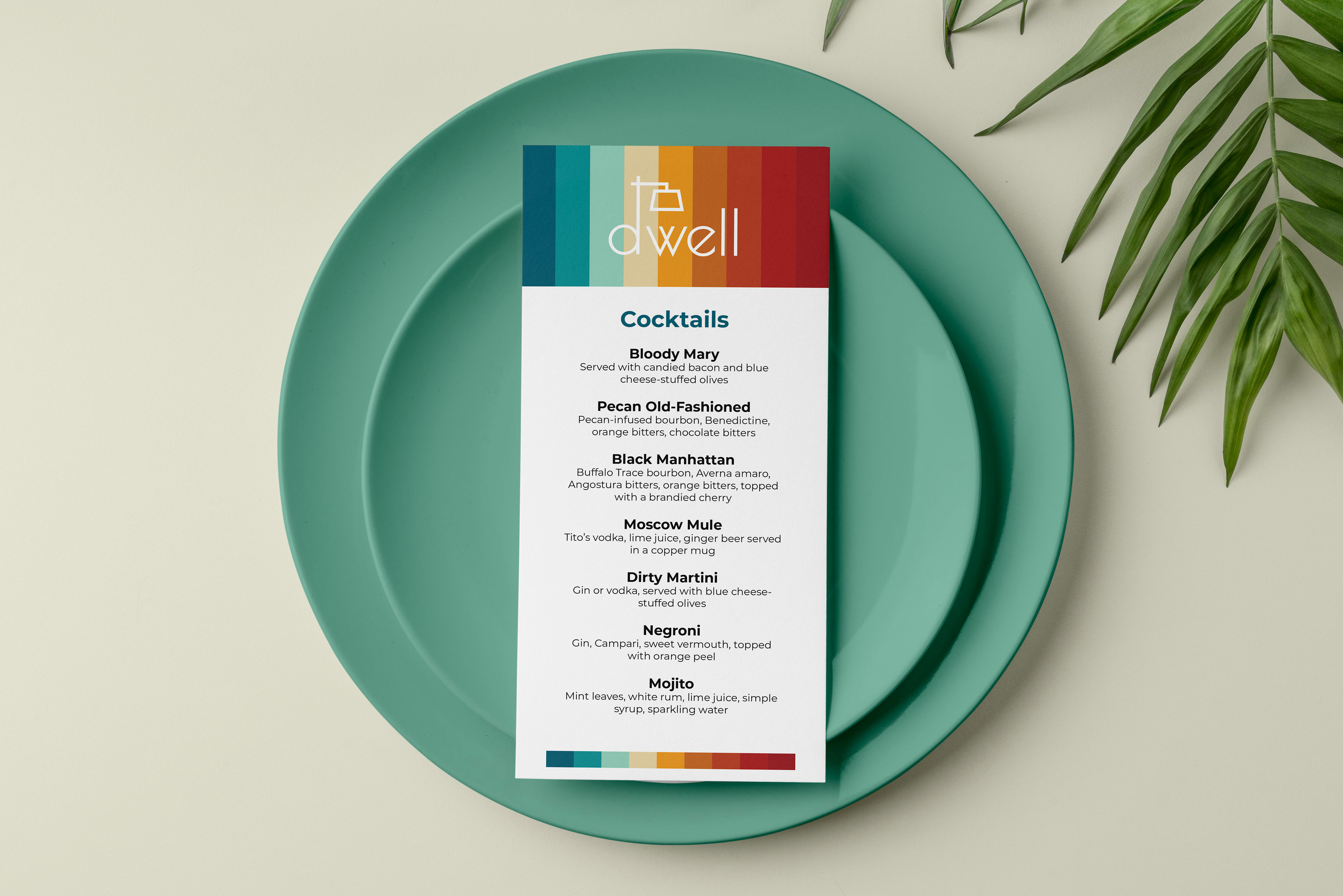
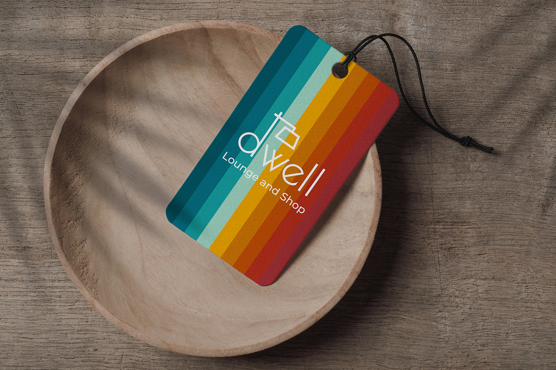
I liked my final logo, but felt it needed something more special. I thought about the audience, and how I want customers to feel like they're welcome no matter their gender, sexuality, or race. I also looked at my favorite vintage piece I own, which is a striped rug in hues of red, orange, and yellow. From there, I came up with a rainbow pattern that represents both a spectrum of people, as well as color palettes from the middle of the 20th century.
Reflection
It was fun to come up with a new business concept where I knew exactly who my target audience was, since it included me. I think the name Dwell works really well, as does the tie-in to local vendors. I think this is the kind of bar a lot of people in Austin would make their regular spot.